
It’s been said that data, not oil, is the world’s most valuable resource. But like oil trapped underground, data is often buried in reports or siloed in systems dispersed among teams. A 2023 Forrester survey underscores this bleak situation, with nearly half (46%) of survey respondents admitting they didn’t know how to find their companies’ data reports, data sets, and insights. Enterprise resource planning (ERP) systems help solve this problem by pulling real-time data together into powerful but easy-to-use dashboards that allow users to quickly see what’s happening and what might be in need of attention.
What Is an ERP Dashboard?
An ERP dashboard is a digital window into the inner workings of an organization’s ERP platform. It compiles key data from departments spread throughout the company and displays it on one screen that is updated in real time. Rather than executives having to ask five different department leaders for individual reports, they can simply pull up the dashboard to see, for example, how much cash is coming in, what products are stuck in inventory, or which projects are behind schedule.
Organizations’ reliance on dashboards has grown significantly, rising from the ninth most important business driver in 2021 to fourth in 2023, according to a Deloitte survey. A good dashboard uses clear visualizations to break down the sheer volume of data most companies capture and store. These visualizations—typically displayed in the form of charts and graphs—provide a mechanism for spotting problems early by highlighting patterns and trends as they happen. A good ERP dashboard also includes real-time output from metrics and filters to let users drill into the data they care about most.
Key Takeaways
- ERP dashboards turn complex, often siloed business data into visual patterns that would not otherwise be easily spotted in spreadsheets or reports.
- Cross-departmental decisions become more aligned when everyone is using the same underlying, real-time data source.
- Leading ERP dashboards evolve as business priorities shift, without requiring additional investment or technical expertise to modify.
Enterprise Resource Planning (ERP) Dashboards Explained
Data visualizations establish the foundation of ERP dashboards, but their value extends far beyond their pretty pictures. Every tile, chart, and alert in an ERP dashboard is present for a reason: to answer a specific business question about financial performance, operational efficiency, or market trends.
ERP dashboards are created within an organization’s ERP system, which integrates modules that pull in data finance, HR, CRM, supply chain management, and other business systems. Unlike standalone platforms that require manual data-syncing from disparate systems, ERP dashboards connect natively to their modules, eliminating data discrepancies, ensuring consistency, and restoring data trust—which 41% of respondents to the Forrester survey said was lacking.
ERP dashboards are built to be interactive, so users can click into charts, dig into underlying data, and follow a data point all the way to its source without switching systems. For instance, a spike in manufacturing costs can be traced back to specific work orders or raw material price increases. This traceability creates transparency and enables faster problem-solving.
ERP dashboards can also be tailored to accommodate different roles within an organization. For example, an HR manager can view key performance indicators (KPIs) tracking employee acquisition turnover, while a CFO can follow top- and bottom-line growth. This targeted, time-saving approach ensures that users see the precise information relevant to their responsibilities without having to wade through unrelated metrics.
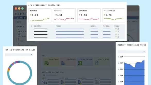
NetSuite Dashboard Portlets
Features in ERP Dashboards
The goal of a dashboard is to make data useful. It should present information clearly, be able to be tailored to different roles, and adapt as the business shifts. Here are five key features to look for in an ERP dashboard:
- Data visualization: Strong visuals make dashboards shine. Charts, graphs, and color-coded indicators turn raw numbers into actionable insights that stakeholders can scan and understand in seconds. A sudden spike in customer service response times or a drop in manufacturing quality metrics, for example, will stand out immediately, without users having to scour spreadsheets.
- Customization: Dashboards should reflect the specific needs of each team member. A sales leader might want to see leads and pipelines front and center, while a logistics manager might want to view delivery performance and carrier costs. The dashboard’s layout, KPIs, and alerts should match the priorities of the person using it.
- Integration: ERP dashboards pull data directly from the underlying system, connecting to and integrating everything from customer relationship data and supply chain metrics to payroll. That means less need for manual reporting, fewer data silos, and more time spent acting on insights rather than chasing data.
- Flexibility: When businesses change tack, dashboards can easily keep up, whether that means adding a new metric, adjusting filters, or building out a different view for a new department. Flexible dashboards make those changes easy for users to handle without requiring IT’s help.
- Security: Role-based access ensures that sensitive data will be visible only to authorized personnel. Multifactor authentication and built-in encryption also help protect business intelligence—security measures that are particularly important when data is accessed via mobile devices. To that end, dashboards should be optimized for easy mobile viewing.
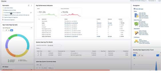
Sales Dashboard Example
Key Benefits of ERP Dashboards
ERP dashboards play a bigger role than many realize. They not only shape how teams spend their time, but they also serve as a handy, straightforward tool to focus leaders’ attention and reactions to market shifts. When done right, ERP dashboards become a source of momentum that guides the daily operational rhythms of an organization. The following are the most common benefits of ERP dashboards:
- Real-time insights: ERP dashboards update data, KPIs, and visuals in real time, so teams aren’t working with outdated numbers. The latest figures are always just a glance away, allowing businesses to quickly identify strengths, pinpoint weaknesses, and uncover opportunities for strategic and tactical improvements.
- Improved decision-making: When trends and outliers are simple to see, it’s easier to act with confidence. Data visualizations clarify where to focus and what requires attention. When everyone from the front line to the C-suite views the same underlying data, cross-functional collaboration also improves.
- Operational efficiency: ERP dashboards cut down on busywork by extracting data automatically. That means fewer spreadsheets, faster reporting, and less back-and-forth manual verification of numbers across teams. Dashboards can also spotlight inefficiencies, helping companies trim operational costs and improve efficiency.
- Customization: With customized ERP dashboards, teams see what matters most to them. Dashboards can be adjusted for different roles, goals, and workflows so users don’t have to sift through irrelevant data. Users can also personalize everything from layouts and alert thresholds to time periods, as well as being able to display daily operational metrics or quarterly strategic indicators based on individual objectives.
- Data integration: ERP systems span the business, meaning that dashboards can pull in everything from payroll to supply chain data. The result is a single, connected view that doesn’t require jumping between tools to get a complete view of data.
- Enhanced productivity: ERP dashboards clear the runway for faster execution. When reporting is automated and accessible, teams spend less time gathering information and more time acting on it. For example, support teams with access to order history, shipping status, and product availability can resolve customer issues faster.
- Performance tracking: Dashboards highlight the metrics that show how the company as a whole and individual departments are doing. KPIs—such as decreasing equipment utilization rates that may indicate production capacity issues or declining on-time delivery percentages that reveal potential supply chain bottlenecks—stay visible, so small issues don’t become big ones.
- User-friendly interface: The best dashboards make complex data easy to read. Clear visuals and simple layouts that present the most important information front and center let users scan, click, and understand without the help of a manual or IT support.
- Compliance and risk management: Dashboards make it easier to track audit trails, tax reporting, or regulatory thresholds. Fast access to accurate data ensures that compliance won’t become a scramble, while robust encryption and permission-based access controls protect sensitive company information from unauthorized viewing or tampering.
- Scalability: As companies grow, dashboards should grow with them. When the ERP is based in the cloud, new entities, teams, and metrics can be added without investments in additional infrastructure or human resources. Performance speed is maintained even as data volumes grow, preventing system degradation.
Make NetSuite ERP Dashboards Work for You
Modern ERP dashboards refine raw business data into actionable intelligence that fuels strategic decision-making across an organization. NetSuite exemplifies this transformation. Its role-based ERP dashboards tailor insights to each user’s responsibilities; executives, for example, see different information than department managers. Of particular use, the company’s ERP-embedded SuiteAnalytics Workbook tool lets users create interactive charts and pivot tables for deep dives into data without needing IT support. The dashboards integrate natively across NetSuite’s cloud-based platform, so data stays consistent from finance to supply chain to CRM. Prebuilt KPIs and customizable layouts also make it easier for teams to focus on the metrics that matter most. This combination of flexibility, integration, and user-friendly design helps businesses respond to challenges quickly and make informed decisions.
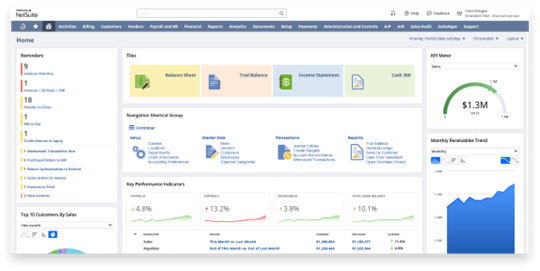
Accounting/Finance Dashboard Example
A good ERP dashboard changes the way a business sees and manages its operations. At its core, it offers a clear view of real-time performance in every department. But with the right design and integration, it goes beyond merely tracking numbers to include spotting opportunities, decreasing risks, and building momentum through smarter decisions.