Sometimes visualizations are a much better way to convey information, show trends or really drive home a point. Bubble charts are one valuable type of data visualization tool that can help businesses analyze data and make a point in a concise, visual and effective way.
What Is a Bubble Chart?
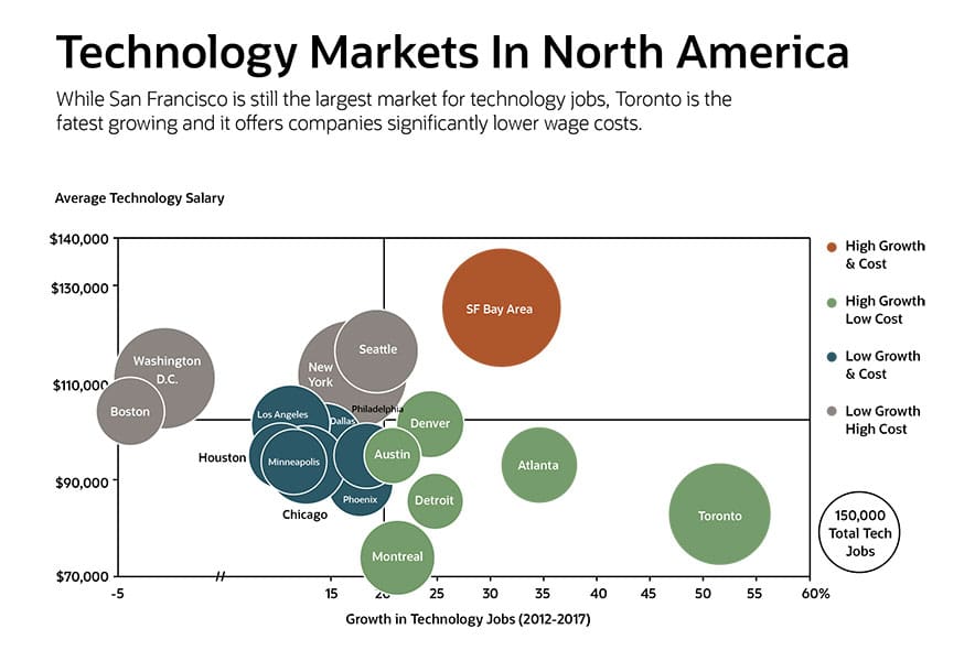
Also called a bubble plot, a bubble chart is a data visualization method that displays multiple circles in a two-dimensional plot. It is a cousin of the scatter chart, except data points are replaced with bubbles. Unlike other types of graphs, a bubble chart can illustrate the relationship between three variables instead of just two.
Key Takeaways
- Bubble charts illustrate three different variables, making them uniquely valuable in displaying certain types of information.
- There are different kinds of bubble charts, including some that use different colors, shapes and labels to convey information.
- Bubble charts can make it easy to digest a relatively large amount of information, but are not ideal for illustrating exact values.
Bubble Charts Explained
How do you read a bubble chart? Each dot corresponds to a data point — the bigger the bubble, the larger the value. The position of the bubble on the x- and y-axis illustrate two additional data points. Some examples where bubble charts are often useful include consumer satisfaction ratings, revenue projections and mapping, and production costs of particular products.

When Should You Use Bubble Charts?
A bubble chart is primarily used to depict and show relationships between numeric variables. However, the addition of marker size as a dimension allows for comparison of up to three variables within bubble charts. In a single bubble chart, we can examine the relationships between any three variables (A to B, B to C, and A to C), as well as make a three-way comparison between them.
Business Uses for Bubble Charts
For businesses, bubble charts are a great tool to show the relationship between variables and compare factors such as cost, value and risk. Visualizing project portfolios via bubble charts can help companies find “attractive” clusters in one area of a graph and compare those with “less attractive” projects or opportunities in a different area of the graph, such as low value, high cost and high risk. A bubble chart could also show total sales or sales growth by geography, using a map instead of a graph.
Variations of Bubble Charts
Bubble charts have been around for centuries. Research indicates that Swedish global health expert and data visionary Hans Rosling was the first to use this chart style to visualize health globally more than 200 years ago. Many variations have popped up since. However, the best type of bubble chart to use depends on your data set.
-
Labeled Bubble Charts
The only difference between a basic bubble chart and a labeled one is that the bubbles are labeled instead of relying on a legend. A labeled bubble chart is typically used when there is a small number of data points.
-
Bubble Maps
In a bubble map, a bubble or set of bubbles is added on top of an image on a map, which is also called a cartogram. The bubbles’ horizontal and vertical positioning are latitude and longitude coordinates. Examples might include population density or the size of a target market in specific cities or countries.
-
Color Variables Bubble Chart
Bubble charts can help you visualize more than three variables by introducing different colored bubbles. Each color could signify a particular trait that differentiates it from other data points included in the chart.
-
Bubble Clouds
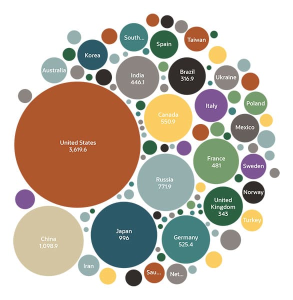
These charts are also called packed circle charts or circular packing. Bubble clouds feature numerous bubbles packed together, usually depicting only one variable, such as population or dollar amount.

-
Scatter Plot
A scatter plot chart is similar to a bubble chart and serves as the foundation for the latter. But a scatter plot generally only compares two variables since they use dots that are all the same size. These charts can illustrate a third variable, often by using color.
Benefits of Bubble Charts
People use bubble charts for a variety of reasons. They’re a way to tell a story visually and can provide a quick assessment of the relationship between different data sets. Well-designed bubble charts effectively display three fields of data, using bubble position and proportion.
Other benefits of bubble charts include:
- Explaining a complex data set easily.
- Analyzing data sets with multiple inputs more easily.
- Helping to visualize patterns and uncover trends using data analysis.
- Helping to correlate data as part of a data series.
- Being dynamic enough to analyze finance, sales and marketing scenarios beyond time-series or whole-to-whole comparisons using line and bar charts.
- Effectively displaying a relatively large amount of information.
- Depicting the relationship between three or even four variables that can change over time without having to use 3D graphs.
Limitations of Bubble Charts
Bubble charts are not ideal if it’s important to depict exact values. Additionally, if data is too complex, or a lot of bubbles are adjacent to each other, the following can happen:
- A bubble chart can become difficult to understand.
- The overlapping of bubbles can make it difficult to distinguish them.
- Users may find it hard to depict zero or negative values.
- It can be hard to ascertain exact values using circle sizes.
How to Create a Bubble Chart
The most common way to create a bubble chart is in Excel or another spreadsheet application, even though some business intelligence analytics platforms are more efficient. But how do you create a bubble chart in this software? The following will help you create a bubble chart using an Excel worksheet.
- Create a blank worksheet or workbook.
- Enter in the data set, making sure there are at least four columns of data.
- In the worksheet, select cell A1, then press CTRL+V or command+V. You've now selected the data set.
- Use the insert tab and select bubble chart from the list of available charts.
- To change the bubble chart style, click on the chart, then choose the design tab. Here, you can change the appearance of the bubbles, including height or width, font size and other features.
Bubble Chart Tips & Best Practices
Charts should be intuitive and easy to understand. Here are a few guidelines to follow to ensure people aren’t confused.
-
Labeling
Make sure the x-axis, y-axis and the value depicted by the bubbles are all clearly labeled.
-
Shapes
It can be tempting to use shapes other than bubbles in this type of chart, but be wary of straying too far from circular shapes. Using non-circular shapes can lead to inaccuracies.
-
Sizing
The size of all bubbles in a chart should be based on the size of the largest one. Be cautious of changing their diameter, as it could misrepresent the data (see the next tip).
-
Scale by Value
The size or area of the bubble should reflect the value. One common mistake is to scale up the bubbles by reflecting its value based on the diameter or radii. But if you do that, a bubble with twice the value of another will end up with four times the area, making the bubble chart misleading.
-
Limit Number of Points to Plot
Sometimes less is more, and too many data points is overwhelming. Limiting the number of data points keeps the chart easier to read.
-
Legend
Just as a map has a legend or key, your bubble chart should include one to help viewers compare and understand the different bubble sizes, identifying which colors and bubbles represent which data points.
-
Show Trends
Your chart should ideally illustrate a trend, with the third variable depicted in the bubble sizes, making a clear point. If the bubble's size doesn't make any difference to your story, consider another type of chart — a bubble chart is probably not the best option.
-
Incorporate Negative Values
Try to avoid encoding negative values with bubbles unless it truly adds value to the plot. A negative value cannot be directly assigned to a point size as an encoding. Additional information will need to be encoded into shape size to indicate negative values.
At this point, you should be ready to create some bubble charts. Bubble charts and their many variations are excellent tools for visualizing data and can help you represent key data points in a more digestible way. Once you start using them, you’ll see their value and figure out what business information they’re most useful for conveying.
Bubble Chart FAQs
What is a bubble chart used for?
A bubble chart is primarily used to depict and show relationships between numeric variables. They are a great tool to establish the relationship between variables and examine relationships between key business indicators, such as cost, value and risk.
What are examples of bubble charts?
Bubble charts can be used to compare any number of variables — for instance, consumer satisfaction ratings, revenue and the production cost of different products.
Can I create a bubble chart in Excel?
Yes, Excel can help you create bubble charts of your own. See above for step-by-step directions for how to create this type of chart in Excel.


