When you’re choosing a chart to illustrate data, you might start with one of the more common formats, like a bar, pie or line chart. Another type — funnel charts — are a great choice for depicting certain processes that are linear and connected.
A common example is the sales process. A funnel chart can visualize how potential prospects become qualified leads, narrow to those who request a quote, and finally to customers. A funnel chart can show the percentage of prospects, as well as the raw figure, still engaged at each stage.
What Is a Funnel Chart?
Funnel charts serve as data visualizations that help readers quickly make sense of trends in data. As you might expect, a funnel chart is usually shown in an inverted pyramid. They’re often used to illustrate stages within a process that are linear, connected and sequential. That is, the first stage typically is completed before the second, the second before the third, and so on. In most of these processes, the largest number of participants occurs at the outset.
As participants move through the process, some drop off at each stage. This drop-off is reflected in the size of that segment of the funnel.

Key Takeaways
- Funnel charts are often used to illustrate stages of linear, connected and sequential processes.
- The first stage in the process generally has the highest number of participants.
- By showing where disproportionate changes occur in the data, such as the number of people or items moving through a process, funnel charts can highlight potential problem areas.
- Alternatives to funnel charts include stacked bar charts and pyramid charts.
Funnel Charts Explained
Funnel charts often are used to show progression through a series of connected stages in a process. For instance, a college admissions officer could use a funnel chart to illustrate the number of individuals who visit the admissions page, the number who then download information, the subset who then attend a meeting on campus or virtually, the even smaller group of prospective students who apply and, finally, those who enroll. The number of participants typically drops as they move through each stage. This is reflected in the size of that segment of the funnel chart.
While funnel charts are often used to show stages within a process, they can be used in other ways. One example is to illustrate the levels of security clearance within an IT organization. At the beginning is the largest group of people or those with no security access. The chart would show the decreasing number of individuals with higher and higher security clearances.
Purpose of a Funnel Chart
A funnel is a type of chart that shows progress through a series of linear and interconnected stages in which the data values typically decrease. One of the most common uses is in marketing and sales to show how the number of potential sales prospects gradually winnows to those who complete purchases. The declining number of participants at each stage is reflected in the size of that segment of the funnel chart.
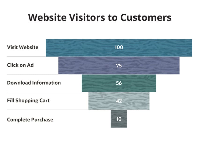
In this way, a funnel chart can bring attention to stages within a process where a disproportionate number of participants are dropping off. Say 100 people visit a website. Of those, 75 click on an advertisement. Next, 56 (75% of 75) download information on a product. Then 42 (75% of 56) place the product in their carts. Finally, just 10, or less than one-quarter of 42, complete their purchases. By tracking this process over time, you can set goals to have fewer people drop off at certain or all stages. Additionally, you can monitor trends over time to see if drop-off is increasing, which could indicate a problem in the sales pipeline.
When to Use Funnel Charts?
Funnel charts can be used in several ways and for multiple different goals — here are a few.
-
Visualize data
Funnel charts can make data easier to understand by displaying it visually rather than a mass of text and numbers. The data visualization can highlight bottlenecks and parts of a process that are working well.
-
Summarize data
A funnel chart can summarize large quantities of data about participation rates at various stages in a process, making it easier identify areas needing improvement. You then can investigate potential reasons for the drop-off rates.
-
Track workflow
While funnel charts tend to be used most frequently in sales and marketing functions, operational areas can also use them to analyze workflows. One example would be using a funnel chart to track the flow of orders from receipt to delivery:
- Receive orders and put them into the system within 24 hours
- Pick items for order within 24 hours
- Package items within 24 hours
- Transport order within 48 hours
- Deliver orders
-
Identify bottlenecks
Funnel charts can highlight bottlenecks in a process. In the above example, assume the drop-off in the number of orders moving through the process is disproportionately large at the packaging stage. You can identify reasons for the larger than expected decline and act to fix them.
-
Analyze conversion rates
Funnel charts are often used to show the percentage of website visitors that click through to view products, the percentage that then places items in their shopping carts and then the segment that completes their purchases. With this information, you can quickly see the conversion rate and identify where it needs improvement.
Funnel Chart Types
Funnel charts typically fall into one of two categories:
-
Trapezoidal
In a trapezoidal funnel chart, the size of each section of the funnel indicates its value. A larger section equals a larger value. For this reason, when viewing trapezoidal funnel charts, it's important to look at both width and height of each section to understand how it relates to the whole.
-
Stacked bar
A stacked bar funnel chart represents each section with a bar. In contrast to the trapezoidal funnel chart, the focus here remains on the widths of the bars as you look from left to right. Wider bars mean the value of that step in the process is larger.
Data or Statistics to Highlight With a Funnel Chart
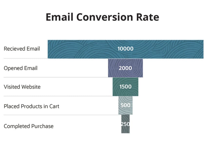
While funnel charts often are used to show the percentage of prospects moving through a sales process, they can be used more broadly. Depending on your business or industry, you may choose to highlight one of many processes that are linear, sequential and connected. For example, a business uses its data warehouse to extract customer information from an email marketing campaign. They monitor how many emails are sent, how many people opened the emails, how many clicks and eventually how many purchases are made as a result. On one side of each bar of data in the funnel chart is the raw figure and on the other is the percentage who moved on from the previous step.
This gives the company a chance to dig even deeper into the data and ask important questions. For example, if they increased the number of new email leads by 25%, what increase in sales could they expect to see? And where are the biggest bottlenecks for moving potential customers along the pipeline? Can they improve their emails, checkout or other process to boost sales?
Ultimately, the type of stat you choose to highlight with your funnel charts will vary by your business and overall goals. Regardless, funnel charts are an efficient way to show the relationship between different stages in a process that is linear, sequential and connected.
Advantages of Funnel Charts
Funnel charts can represent data so that it's easy to read, understand and identify problem areas. They're well suited to illustrate connected, sequential steps in a linear process. Alternatively, they’re not a good way to illustrate individual analysis. For example, following the product lifecycle of a single item. Instead, they’re useful to look at processes from a macro-level view.
Challenges (or Common Issues) of Funnel Charts
While funnel charts can be handy, you'll want to be aware of several shortcomings:
- Funnel charts tend to be hard to read when the number of stages within a process would require more than about six sections.
- While funnel charts can illustrate sequential stages of a process, not everyone will take a linear path through the process. For instance, a website visitor may browse a bit, put some items in a shopping cart, go back to read more product information, take some items out of the cart and then put new ones in.
- Funnel charts are generally not effective for comparing variables, like how sales of ice cream vary between sunny and cloudy days.
- While funnel charts can show where problems exist within a process, they can't tell you why. That requires additional research.
Funnel Chart Examples
Here are two funnel chart examples:


Funnel charts can also serve to point out areas to investigate. This example of a website conversion funnel chart presents an opportunity for improvement further down the workflow, as the funnel narrows consistently until the final step between placing items in an ecommerce shopping cart and actually making the purchase.
Using this information, the business would want to use analytics to investigate what was causing the cart abandonment. Is there an issue with the checkout process, such as a technical problem or a popular form of payment not being accepted? Was the price higher than customers anticipated, perhaps from a high shipping cost? Are customers actually just using the shopping cart to “save” or “favorite” items? Whatever the explanation, the funnel chart serves as a quick data visualization to help guide decisions.
Funnel Chart Best Practices
The following steps are key to accurately and effectively representing data in a funnel chart:
- Size the bars in a bar-based funnel chart so they accurately reflect the relationship between the numbers. Assume 100 people visit a website, 50 add items to their carts, and 25 complete purchases. In this chart, the middle section should be half the width of the top and the bottom section half the width of the middle.
- Use a different color or shade of a color for each section of the funnel so readers can quickly distinguish between them.
- Make any text or captions short and easy to read.
- Use funnel charts when the number of sections is between about four and six. Any lower and a funnel chart won't add much insight; any more, and it becomes confusing to read.
Alternative Chart Types
In addition to funnel charts, several other types of charts can illustrate the data for which a funnel chart makes sense.
-
Stacked bar chart
Bars are aligned to the left or bottom axis rather than to the center, as they are with a funnel chart.
-
Pyramid chart
This is essentially a funnel chart turned upside down. When you view it, the final stage is at the top rather than the bottom.
-
Area chart
A version of line graphs, area charts are ways to show the progression of a single data point over time. The main difference between a simple line graph and an area chart is that with area charts the section under the line is filled in.
-
Bubble chart
Also known as a bubble plot, this visualization method displays circles in a two-dimensional plot. But with a bubble chart, the size and placement relative to the X and Y axes allows the chart to illustrate the relationship between three variables instead of just two.
Conclusion
Charts and other images can help you sort through a barrage of information so you can more quickly make informed decisions. Funnel charts are particularly useful in showing progress through a series of related steps that make up a linear process.
#1 Cloud ERP
Software
Funnel Chart FAQs
What are the alternatives to funnel charts?
A common alternative to a funnel chart is a pyramid chart. This essentially is a funnel chart turned upside down. Stacked bar charts are another option. In a stacked bar chart, the bars are aligned to either the left or bottom axis, rather than to the center, as they are in a funnel chart.
What is a funnel chart used for?
Funnel charts are most often used to show sequential and connected steps in a linear process. The number of individuals or items tends to decrease when moving through the process. Consider a marketing campaign. A percentage of individuals who receive a marketing email will open it. A smaller percentage will proceed to the website, and yet a smaller percentage will put items in their shopping carts. The final stage, making a purchase, will generally include the smallest number of individuals.
How do I create a funnel chart in Excel?
To start, enter and arrange your captions and data points. Each should have its own cell on the same line. (So, if the number of website visitors is 250, the caption “Website Visitors” is in cell C3 and the number “250” in cell D3.)
Highlight the chart data. From the "Insert" tab, head to the "Charts" section. Click the icon that says, "Create waterfall, funnel, stock, surface or radar chart," and then click "funnel." The program will generate a funnel chart.
How do I create a funnel chart in Excel 2016?
The process to create a funnel chart in Excel 2016 is very similar to other versions. After entering your information into cells, highlight the data and from the Insert tab, click charts. Select the “funnel” option and it will create a chart for you.
What is a funnel report?
A funnel report typically includes the numerical information used to create the funnel chart.


