A well-known adage says, "a picture is worth a thousand words." Pictures can capture attention, quickly convey information and clarify complex concepts. And, research shows, images can be effective in business.
For instance, a study by BuzzSumo looking at more than 100 million Facebook updates found those with images had 2.3 times more engagement than those without. Still, the impact of pictures extends beyond social media. Another study from TechSmith found roughly two-thirds of people understand information better when it’s communicated visually.
Charts are frequently used in business settings and can help viewers quickly grasp the information being conveyed — a valuable benefit, given the volume of information everyone must process each day, especially in today’s hyper-connected world.
What Is a Chart?
A chart combines text, symbols and/or graphics to show the relationship between multiple data sets. They are a popular method for sharing information in different settings. For instance, a bar chart could show how sales of a particular flavor of ice cream have changed over the past five years. The length of each bar would indicate sales for that year.
Key Takeaways
- Charts enable you to visually compare multiple sets of data.
- Charts can help people better understand and remember information. Many people understand a picture more quickly than blocks of text.
- A compelling chart can help you make your point more convincingly and lend credibility to your presentation.
Charts Explained
What’s the difference between a chart and a graph? While the terms “chart” and “graph” may seem interchangeable, there are subtle differences. To start, graphs are a type of chart, but not all charts are graphs. Graphs focus on raw data and depict trends over time, which is not true of all types of charts.
In contrast, a chart conveys data sets in a format that helps viewers understand them. That is, the quality of the presentation helps determine the effectiveness of a chart.
Why Are Charts Important to Businesses?
Most business presentations include at least one chart, and often several. There’s a reason for this — because charts can quickly convey a great deal of information and help viewers remember the data presented, they enable businesspeople to more quickly make informed decisions and take action.
As companies become increasingly data-driven and monitor more data, charts have become an increasingly valuable tool. They help executives quickly get the pulse of their business, while department heads might use charts to examine the effectiveness of a new strategy or campaign and its impact on their team.
When and How Should Charts Be Used?
Charts are most valuable when you need to quickly convey the relationship between two or more sets of data and you’d like your audience to retain this information. They have countless uses, as modern businesses lean on data to shape their strategies and priorities.
For instance, a chart can quickly show how sales and/or expenses have changed for a business unit over a set period of time. Or it could display something more specific, like an increase or decline in the number of orders fulfilled per hour at a particular warehouse. We’ll show examples of the various types below.
Benefits of Businesses Using Charts in Data Visualization
By visually showing the relationship(s) between sets of data, a chart can help bring information to light in an easier-to-comprehend manner than reading blocks of text. This is a much better approach than showing lists or tables of numbers that force viewers to process the information and determine trends. Technology has made it easier and, in many cases, automated the creation of charts, so business leaders have come to rely on them when they make decisions.
For example, a bar chart that shows how expenses vary between two similar manufacturing plants can help management quickly pinpoint which expenses appear higher than they should. Armed with this information, they can look into the issue to find the cause and then identify actions to reduce expenses.
Parts of a Chart
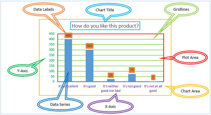
While the various types of charts show information in different ways, most share a few common elements. These include the following:
-
Title
The title should let viewers quickly grasp the data presented in the chart. An example: “Sales of Products A, B and C Over the Past Five Years.”
-
The Horizontal and Vertical Axes
With the exception of pie charts, most charts have vertical and horizontal axes. Each is used to present at least one set of data. Both also incorporate scales that indicate the starting and ending point of the information presented.
-
Horizontal Axis
The horizontal axis, also known as the x-axis, typically represents the value that’s known — often the time period. Say a chart shows ice cream sales over time. The years typically would go on the horizontal axis.
-
Vertical Axis
The vertical or y-axis usually shows the “unknown” value. In the above example of ice cream sales, the volume of ice cream sales for each of the relevant years would be shown on the vertical access.
-
Data Series
The data series refers to the information set presented in the chart. All charts are based on some type of data series. Returning to the example of ice cream sales, it would be the amount of ice cream sales each year.
-
Key
A key or legend helps explain the information in the chart. Say the chart breaks out ice cream sales by region and uses differently colored bars for each region. The key would indicate which color correlated with which region.
There are five basic types of charts that people will come across regularly. They are line charts, bar charts, pie charts, column charts and area charts.
Common Types of Charts
Each type of chart has its pros and cons and will work better for certain use cases than others. Some of the more common types include:
-
Line Graphs
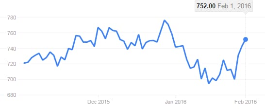
Line graphs typically are used to show changes or trends in continuous data over a period of time, with a line connecting the dots that represent the different values. For instance, in a line chart showing a company's stock price over the past week, a line would connect the dots that visualize the change in price each day.
-
Bar Graphs
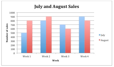
A bar graph, as you might guess, uses bars to convey data. The longer the bar, the greater the value. Say a bar graph shows sales per store for the past quarter. If sales at Store 100 were twice the sales at Store 200, its bar would be twice as long.
Bar graphs can be vertical or horizontal. One axis shows the categories; in the above example, this is the stores. The other shows the values, such as sales. Generally, horizontal bar charts allow you to compare more data sets.
Bar graphs are useful in showing disparate data sets, such as sales by store or of different flavors of ice cream. Each flavor can get its own bar. They also tend to work well when the changes you’re trying to convey are larger. If the changes are small, the differences in the bars' lengths might be too small to easily discern. They also can show negative numbers with bars below the x-axis.
-
Bubble Chart
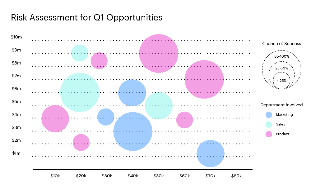
Bubble charts can be an effective way to show how different values compare to each other, with larger bubbles representing larger values. For example, a chart showing the populations of the 10 largest cities in the world would include a larger bubble for Tokyo, Japan, which has about 37 million people, than for Beijing, China, which is home to about 19 million people.
-
Area Chart
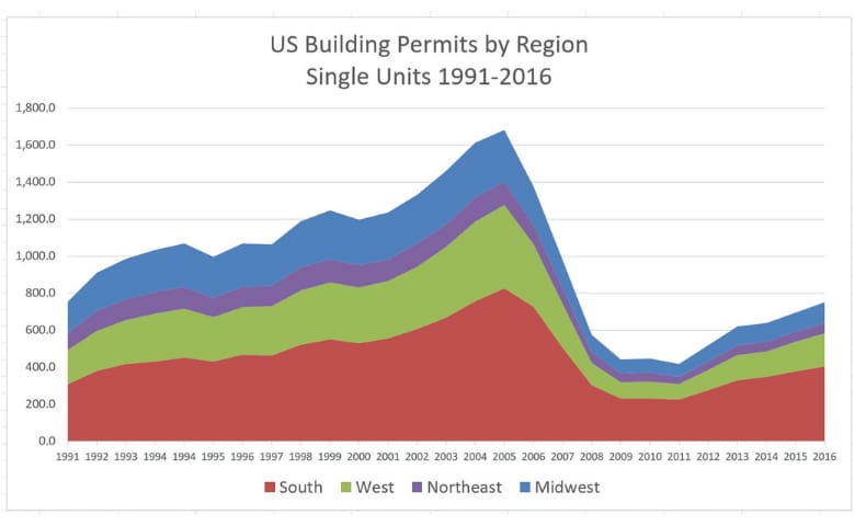
An area chart is an offshoot of the line chart. It’s often used to compare several quantities, such as sales in different regions. After plotting a line that shows each region’s sales, the area between each of the lines is filled in with different colors.
Area charts tend to be most effective when you have several variables to compare, but typically no more than three or four. Any more than that, and deciphering the graph becomes difficult.
-
Pie Charts
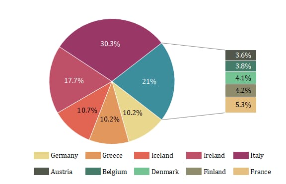
A pie chart is one way to display how various parts make up a whole or 100 percent. Each data point is represented by a "slice" of the pie; the slice's size correlates to the percentage of the whole it comprises. Say a bakery uses a pie chart to show the breakdown of muffins by flavor: blueberry (50%), almond poppy seed (25%) and banana nut (25%). In the chart, the slice for blueberry would be half the pie, while the slice for almond poppy seed and banana nut would each be one-quarter.
Pie charts tend to be most effective when each individual has their own copy of the chart. If you're presenting to a large group and using a whiteboard or screen, pie charts can be challenging to interpret.
-
Heat Map
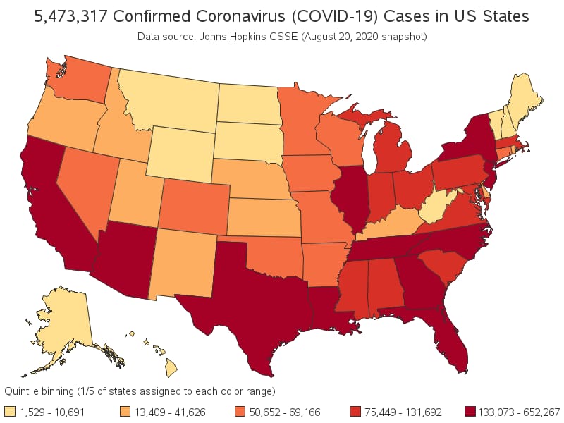
A heat map uses color to depict data. While reporting on the COVID-19 pandemic, for instance, many news outlets used heat maps to show which parts of the country were experiencing outbreaks. States with severe outbreaks often were colored red, those with less severe outbreaks were orange and those with even fewer cases were yellow. Viewers could quickly assess the severity of the outbreaks in their state or region.
-
Scatter Plots
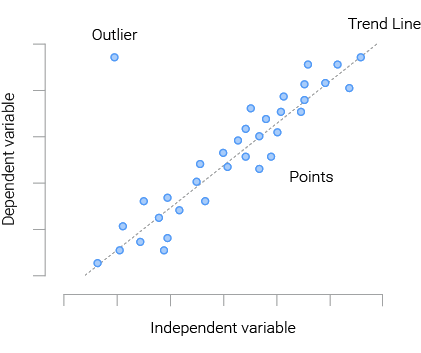
Scatter plots use dots to show the relationship between two variables. For instance, you might compare the players' average height on 10 basketball teams against the number of games each won during the season. The horizontal axis would show the number of games won, and the vertical axis, each team's average height. If a team's average height is 6 feet, 4 inches and it won 25 games, you'd place a dot where those two variables on the axes intersect. As you fill out the chart for each team, you can determine how strongly height correlates with the number of games won.
In interpreting scatter plots, it's important to keep in mind that they show correlation, but not necessarily causation. Whether one variable — in the above example, team height — causes the other variable — games won — would require further investigation.
-
Dual Axis Chart
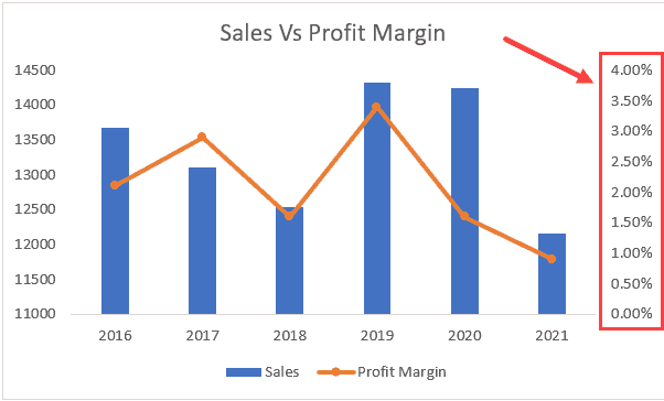
A dual axis chart allows you to show the relationship between two sets of variables. In a business setting, the two variable sets often are revenue and net profit. To show each by month over the past year, you’d use both vertical axes — sometimes referred to as the y- and y2-axes.
On the left axis or y-axis, you might show revenue in $1 million increments from $1 million to $10 million. Then you’d use the right or y2-axis to show profit, in $100,000 increments from $100,000 to $1 million.
Dual axis charts also often combine several chart types. In this example, you might use bar charts to show monthly revenue and a line chart to represent profit.
-
Gantt Charts
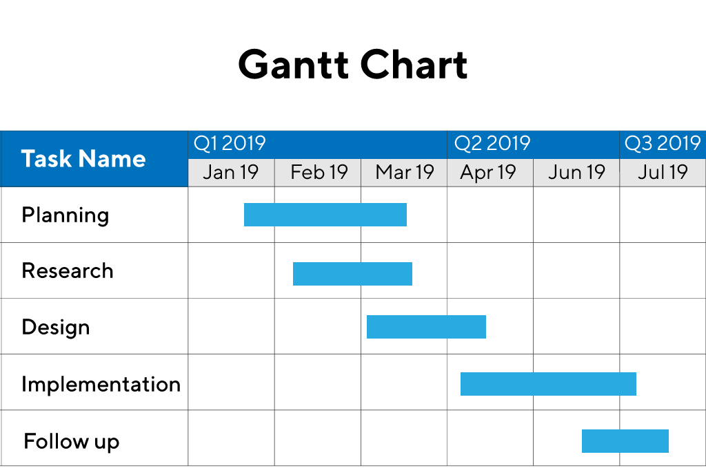
Gantt charts are used to manage project schedules. The horizontal axis shows the time frame, while the tasks required to complete the project are on the vertical axis. The bar for each task correlates with its start and end date.
-
Radar Chart
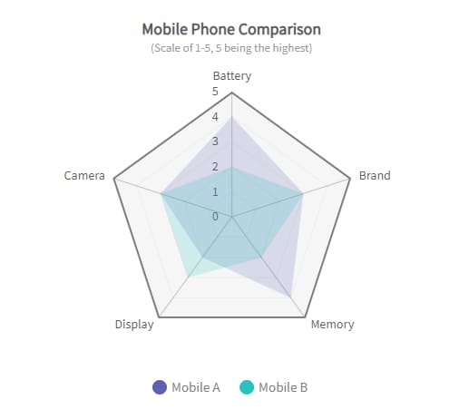
Radar charts are one way to represent multiple variables. They’re also called spider or web charts due to their shapes, which often take the form of hexagons, octagons or similar forms. In other words, instead of two axes, radar charts typically incorporate between five and eight. They’re particularly effective at showing where data overlaps and where it differs.
You might use a radar chart to compare the strengths, such as size, market penetration and number of product lines, of different competitors. You'd rank each competitor on each attribute, with each angle joined in the chart referring to a specific attribute.
-
Column Charts
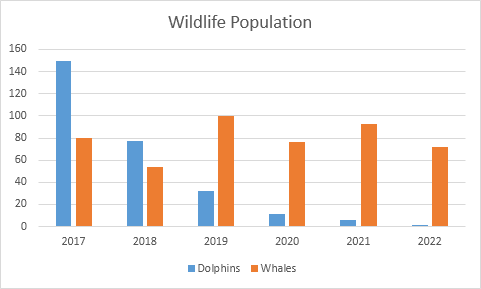
These are similar to bar charts in that the length of each column corresponds with the value of the data it represents. They're well suited for comparing several sets of data over time. For example, you might use a column chart to show sales of both red T-shirts and blue T-shirts by month over the past year. Each month identified on the horizontal axis would incorporate two columns: one for the red T-shirts and another for the blue.
-
Pictograph
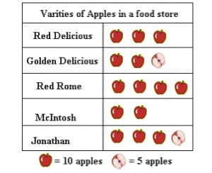
A pictograph uses pictures or symbols to display data. A pictograph with multiple rows of people in different colors could show how many people work in different departments at a company. For instance, all the people in green might work in sales and those in yellow in accounting.
-
Venn Diagrams
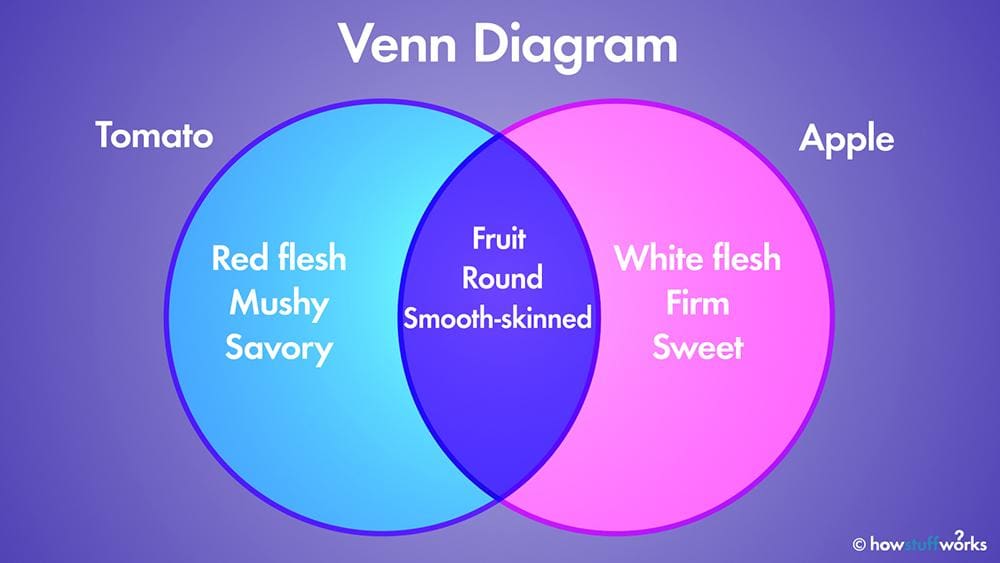
Venn diagrams use overlapping circles to show how data sets overlap. The greater the degree of overlap between the data, the more the circles themselves will overlap. Say you want to show how many customers purchase Product A, Product B or both. Your data shows that 25% of those that purchase one product also buy the other. The circles would overlap by about 25%.
How to Create Basic Charts
To ensure your chart adds interest to your presentation and engages your audience or viewers, a few steps are key:
-
Assess the information you need to present. Review the various types of charts to identify the type that can most accurately convey this information in a way that’s easy to understand.
-
Consider your audience and how they'll use the information. For instance, charts used in a presentation to the executive team often need to quickly convey information that helps them make decisions. Conversely, a project manager would use a detailed Gantt chart to help keep a project on schedule.
-
Similarly, consider how you’ll be presenting the information. Pie charts, for instance, can be difficult to interpret if viewers are looking at them from a distance, especially if there are many narrow “slices.”
-
Use bright and distinct colors for the information you want to highlight. Red, for instance, conveys urgency — a reason it often was used to show the areas of the country experiencing the most serious COVID-19 outbreaks.
-
Resist any temptation to adjust a chart to make the results appear different than they are. Say a marketing promotion was expected to boost sales by 10%, but sales only increased by 3%. By adjusting the increments used on the vertical axis, it may be possible to make the sales increase look larger than it was. However, such maneuvers are misleading and once your audience realizes what you’ve done, you lose credibility.
Clear, compelling, and easy-to-read charts and data visualizations can strengthen and lend credibility to a presentation and help others understand complicated information more quickly. Most people understand that it’s much easier to process and hold onto information seen in an image rather than text, whether in their personal or professional lives. As data interpretation and management becomes a key responsibility for more employees, it’s critical that they learn how to create and use charts.
Chart FAQs
How do I choose the best chart for my data?
A chart should accurately represent your data, make it easy to understand and present information in a compelling way. Experiment with several different charts to find the one that you feel most appropriately conveys your data.What types of data correspond to which charts?
While many charts can be used in a number of different ways, some are better at conveying specific types of information. Pie charts show how various parts create a whole, while a double axis chart can show how two sets of variables interact. By reviewing the types of charts and the type of data you need to convey, you can identify the most appropriate chart.What are the 16 types of charts?
Here’s a list of 16 popular types of charts:
- Area Charts
- Bar Graphs
- Bubble Charts
- Column Charts
- Dual Axis Charts
- Flow Charts
- Gantt Charts
- Gauge Charts
- Heat Maps
- Line Graphs
- Pictographs
- Pie Charts
- Radar Charts
- Scatter Plots
- Venn Diagrams
- Waterfall Charts
How Do I Make a Google chart?
Google Charts helps you convert data to a chart. More information is available at https://developers.google.com/chart.


