Without repeating a particular cliché comparing the value of a picture to 1,000 words, there’s no doubt that adding a graphical element to communication can significantly increase its effectiveness. Clear, effective and efficient communication is essential in any organization.
When explaining trends to stakeholders, incorporating charts or graphs can help the audience better understand and remember information when words alone aren’t as effective.
What Are Area Charts?
An area chart is a graphical representation of data that shows how the numeric values of one or more data sets change relative to a second variable. This second variable is typically time. For example, an area chart used for market analysis and demographic changes might show how the proportions of age groups in a population change over several decades.
Area Charts vs. Line Charts
An area chart differs from a line chart both in the visual presentation and the information provided. A line chart shows how a single value on the vertical axis or y-axis changes as it progresses along the horizontal axis, or x-axis. Using the age groups over time example above, this might be a single line showing how the total population changes over each decade. Or it might be a different line for each age group, i.e., one line to show the change in the number of 0 – 25-year-olds, another line for 26-50-year-olds and so on. From a geometrical standpoint, this is a one-dimensional representation.
An area chart includes shading between the y-axis figure and the baseline. An area chart also often adds a second variable (or dimension), to represent an amount of something or its proportion of the total. Another way to think about an area chart is that they can represent several bar charts that change over the x-axis progression, which often represents time. If the age groups 0 – 25, 26 – 50, 51 – 75 and 75+ are represented by the colors red, blue, yellow and green, respectively, the red area increases as the proportion of 0-25-year-olds increased relative to the total population.
Key Takeaways
- Area charts use shading to emphasize data trends and often add a second variable, which line graphs or pie charts do not have.
- Area charts help illustrate trends over time, starting with a common baseline.
- Area charts don't work well for illustrating precise values or a really large number of data sets.
Area Charts Explained
Area charts show trends over time, much like a line chart; however, area charts add an extra dimension visually and contextually by shading in the areas between lines with color to represent an area. The relative size of the colored areas gives a visual sense of the magnitude of the different values. While pie charts also give a sense of volume, they don't provide the linear view that area charts can provide.
For example, an area chart illustrating the gross domestic product (GDP) of major countries over the last 100 years would show that the total GDP for the entire world has grown significantly. Also, it could show that the relative proportion of that total made up by countries like the United Kingdom and France has decreased relative to evolving economies like China and India. That means area charts illustrate changes in quantities over time and changes in relative quantities over time.
When to Use Area Charts
Area charts are great tools when working with relatively small numbers of related data points that combine to make up a more comprehensive data set. For example, a company might use an area chart to represent the change over time in the proportion of sales made via its primary sales channels — email marketing, online search, internet ads, partner referrals and others.
An area chart would show how the proportion of sales made through each channel changes over time. These changes would be depicted visually to make it more easily understood.
Data Analysis
Area charts are used primarily to illustrate trends instead of detailed breakdowns of information, for which they are poorly suited. Area charts work well for data analysis with high-level comparisons of a relatively small number of data sets.
Trying to illustrate sales volumes of hundreds of product codes on an area chart would be messy and complicated, for example. But breaking data points into four or five buckets based on the type of product could provide a high-level analysis of sales data over time.
Trend Analysis
Area charts are great tools for showing trends. Because the areas corresponding to different values have two variables, their relative sizes stand out visually, and it's easy to get a quick impression of changes in scale and proportion over time.
Illustrating trends on area charts can be a great attention-grabber and convey a significant amount of information in a single image. They provide an easy-to-understand focal point for discussion and analysis.
Why Use Area Charts
Area charts are great tools for illustrating information because of their fundamental characteristics: it provides an easy-to-follow comparison of how individual segments make up a larger data set over time. Here are a few other reasons why area charts are useful tools:
-
Makes Data Seem More Tangible: Simply having the area between multiple lines colored adds another visual variable to the data. Psychologically, a large red area on a chart is easier to grasp than a point on a line graph.
-
Illustrates Part-to-Whole Relationships: Area charts immediately show the viewer how different parts of a whole relate to one another and the whole.
-
Illustrates Trends Over Time: As one moves along the x-axis, typically representing time on an area chart, patterns become clear. For example, a product line's declining importance would be more noticeable as its colored segment continues to shrink in size relative to other, growing segments.
-
Demonstrates Magnitude of Changes in Related Data: Area charts highlight the magnitude of changes more effectively than purely numerical data, particularly for visual learners. Reading that Product A grew from 15% of a company's sales in 2000 to 95% in 2020 is far less impactful than seeing that information illustrated in shapes and colors on an area chart.
Common Business Uses for Area Charts
Area charts are a popular tool in business reporting. Again, it's important to remember that area charts are better suited for high-level reviews of trends of a relatively small number of related data sets. For example, an area chart could be used to report the changes in how much a handful of crucial product or service categories contribute to revenue over the previous fiscal year or several years. The change in the size of each colored cross-section of the area chart is a clear indicator of relative and absolute changes in those categories over time. The same concept can be applied to expenses by depicting the costs associated with things like labor, raw materials, leases, travel and other categories relative to total expenses.
Area charts can report on external factors impacting a business and show the change in how much market share different companies have captured. If two or three companies grow their colored areas of the chart over time, it represents market share consolidation. The emergence of a new and growing colored area would show that a newcomer to the market is quickly capturing market share from existing businesses.
Another use for area charts would be to report changes in consumer behavior, such as spending on different categories of goods and services as a percentage of disposable income or total income. Similarly, an area chart could illustrate changes in customers’ preferred methods of shopping over time. An area chart might illustrate that online shopping has grown in importance in recent years at the expense of in-person shopping.
Features of Area Charts
An area chart's structure is relatively straightforward and this simplicity contributes to its effectiveness in conveying high-level information.
The features of an area chart are:
-
Chart Title: This is the label for the entire chart. It should be short and straightforward and convey what's contained in the data series presented. For example, "Revenue by Product Line, 2010–2020."
-
Key: The key connects the colors used to the data they represent. For example, “Green = Product ABC; Blue = Product XYZ.”
-
Label: Each axis should have a label indicating what it measures. The horizontal x-axis typically represents time. The vertical axis, or y-axis, generally represents a quantity, like the number of units, dollars or population.
-
Scale: Each axis also needs a scale to indicate the values of points along the axes. Time along the horizontal x-axis might have a scale with increments of one month or 10 years. Values along the vertical axis could have a scale with increments of thousands or millions of dollars.
-
Chart Area: The area of the chart represents the magnitude of the values being measured. That is the distinguishing feature of an area chart. Large or growing areas grab attention as essential components of the overall chart.
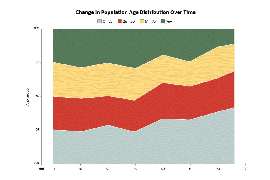
Types of Area Charts
Area charts have been a widespread reporting and presentation tool for some time, so it’s no surprise that there are a few variations. There are six primary types of area charts that display the data and areas somewhat differently.
-
Simple Area Chart: A simple area chart is essentially a standard line graph with the areas below each line filled in. The challenge with simple area charts is that the areas beneath the lines necessarily overlap. That means that some categories can completely hide smaller categories if the smallest areas aren’t displayed closest to the viewer. Another strategy is to make the areas partially transparent instead of solid colors to allow viewers to see areas through the larger categories.
-
Stacked Area Chart: As its name implies, a stacked area chart places data sets on top of one another along the vertical axis instead of using shading to display data in front or behind the other values. So, instead of starting each area at zero, new areas are added on top of existing areas. Therefore, the top section of the data set will correspond to the total of all groups.
-
100% Stacked Area Chart: The 100% stacked area chart is similar to the stacked area chart. The difference is that instead of quantities charted along the vertical y-axis, percentages are used, adding up to 100%.
-
3D Area Chart: As one might guess, a 3D area chart adds a variable on top of two-dimensional area charts. For example, a two-variable area chart showing sales numbers at different points in the day could be expanded to a 3D area chart by adding a third z-axis with different days of the week, in addition to the time of day along the x-axis. That is another way to view a simple area chart that helps prevent the issues that overlap in the standard 2D version.
-
Stacked 3D Area Chart: A stacked 3D area chart takes the layers along the z-axis of an unstacked 3D area chart and stacks them on top of each other. There isn't generally any additional data provided by making a stacked area chart three-dimensional; it's more of a visual enhancement to benefit viewers.
-
100% Stacked 3D Area Chart: Just as a stacked 3D area chart is an aesthetic improvement over a standard stacked area chart without necessarily conveying any additional information, a 100% stacked 3D area chart does the same thing with a 100% stacked area chart. Instead of incremental values, the 100% version of the stacked 3D area chart uses percentages out of 100% along the vertical y-axis.
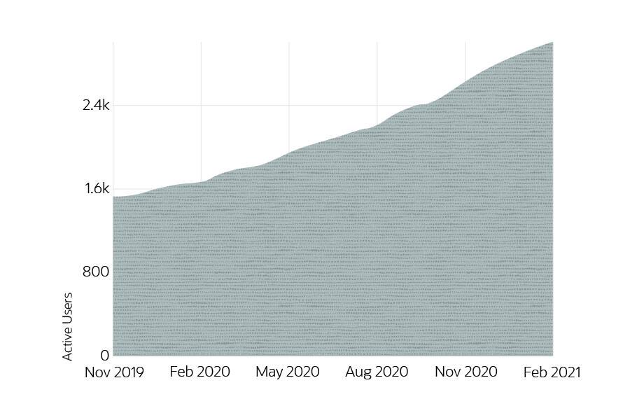
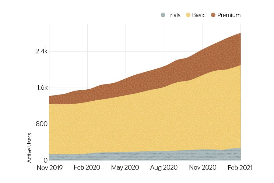
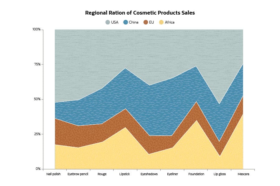
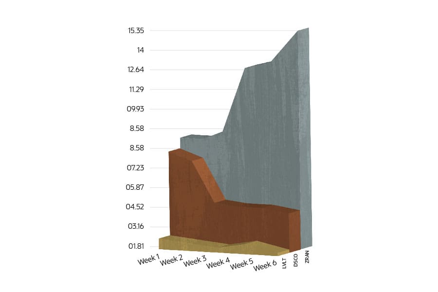
This page shows a visual for each of the six types of area charts described above and should be used as the template. Using the age group by year example above. We've included values for absolute numbers and percentages to make it as easy as possible for them to convert to a graphic:
| Year | Age Group | Value | Percentage |
|---|---|---|---|
| 1950 | 0-25 | 76.50 | 45.00 |
| 1950 | 26-50 | 59.50 | 35.00 |
| 1950 | 51-75 | 25.50 | 15.00 |
| 1950 | 75+ | 8.50 | 5.00 |
| 1960 | 0-25 | 77.49 | 43.00 |
| 1960 | 26-50 | 59.47 | 33.00 |
| 1960 | 51-75 | 32.44 | 18.00 |
| 1960 | 75+ | 10.81 | 6.00 |
| 1970 | 0-25 | 77.85 | 40.00 |
| 1970 | 26-50 | 63.06 | 30.00 |
| 1970 | 51-75 | 38.59 | 17.00 |
| 1970 | 75+ | 31.87 | 13.00 |
| 1980 | 0-25 | 90.91 | 36.00 |
| 1980 | 26-50 | 72.83 | 28.00 |
| 1980 | 51-75 | 42.86 | 16.00 |
| 1980 | 75+ | 55.19 | 20.00 |
| 1990 | 0-25 | 93.79 | 33.00 |
| 1990 | 26-50 | 76.11 | 26.00 |
| 1990 | 51-75 | 54.27 | 18.00 |
| 1990 | 75+ | 71.43 | 23.00 |
| 2000 | 0-25 | 95.03 | 30.00 |
| 2000 | 26-50 | 80.78 | 25.00 |
| 2000 | 51-75 | 75.80 | 23.00 |
| 2000 | 75+ | 73.96 | 22.00 |
| 2010 | 0-25 | 95.07 | 28.00 |
| 2010 | 26-50 | 89.16 | 26.00 |
| 2010 | 51-75 | 79.66 | 23.00 |
| 2010 | 75+ | 80.46 | 23.00 |
| 2020 | 0-25 | 90.08 | 25.00 |
| 2020 | 26-50 | 85.36 | 23.00 |
| 2020 | 51-75 | 95.56 | 25.00 |
| 2020 | 75+ | 106.30 | 27.00 |
Benefits of Area Charts
Area charts are widely used in many business settings because they provide several significant benefits.
-
Visually Stimulating. It's hard to quantify the visual appeal of seeing a filled-in area to represent data instead of a simple line. It sounds like a slight difference, but area charts are genuinely more effective than line graphs.
-
Easier Understanding of Relationships. Area charts are great for showing both part-to-whole relationships as well as the magnitude of related data. Seeing that Product A makes up 35% of sales, while Product B makes up 65% on an area chart is much more impactful than simply reading those figures because you can see a visual representation of each component's magnitude.
-
Demonstrating Developments Over Time. Area charts paint a clear picture of the significance of changes to different groups over time. As the size of an area representing a data set expands or contracts over time within the chart, it's easy to appreciate that data's general significance without needing to dig into specifics.
Limitations of Area Charts
Despite the benefits discussed above, area charts aren't perfect for every situation. There are some limitations to this tool.
-
Too Many Groupings. Area charts become difficult to read and cluttered when there are too many groupings to track. It's hard for human brains to digest all that information at once. For example, a chart showing the change in population over time of all 50 U.S. states would get extremely cluttered in an area chart.
-
Difficulty With Granular Data. Area charts are best used for showing broad trends and relationships. When a more detailed analysis is needed, area charts generally aren't great options.
-
Overlapping on Simple Area Charts. Unlike stacked area charts, simple area charts can get confusing due to the overlapping areas. It's essential to be clear in the colors and shading used and call out that the audience is looking at overlapping instead of stacked areas to avoid confusion and prevent them from drawing the wrong conclusions.
Area Chart Best Practices
There are some best practices that users can follow when working with area charts. These tips help ensure area charts are clear and effective at conveying data and relationships.
-
Limit the Number of Data Sets. Area charts can get confusing and cluttered if too many data sets are used. Five to 10 groupings are a safe benchmark to use as an upper limit, but that’s just a ballpark. It may be possible to include more, so long as there is sufficient space for viewers to interpret the data.
-
Keep Small Values in Front with Simple Area Charts. Simple area charts start every grouping from zero instead of stacked area charts, which put areas for new groupings on top of existing groupings. That means that groupings with small values can get covered up by those with greater values. A best practice is to order the areas from smallest to largest when moving from front to back from the viewer's perspective.
-
Start the Y-Axis Scale at Zero. There are several well-founded reasons to start a y-axis at a non-zero value for various charts, like line charts and bar charts. For example, it might make sense to start the scale at $125 for a chart showing the changes over time of a stock price that always sits between $150 - $175, which allows the chart to show greater detail by focusing on the areas that change. But in an area chart, one of the significant benefits is seeing relationships between data. Starting the y-axis at a non-zero value distorts the perceived magnitudes of those relationships.
Area Charts in Data Visualization Tools
Many data visualization tools available commercially, including spreadsheet tools, have built-in capabilities to create area charts. Most of these tools support the stacked area chart but not the overlapping simple area chart. Depending on the amount of customization offered by the visualization tool, a more complex version of area charts may also be possible, although creating them might require some know-how and customizations.
Although basic spreadsheet applications like Microsoft Excel can display information in area charts, they will generally offer less flexibility than more advanced tools dedicated to data visualization. Some business systems can also portray information in area charts as part of dashboards or reports that refresh frequently.
Visual representations of data can be extremely valuable tools when appropriately used in business communication, whether that be presentations or reports. Getting the most out of visuals requires selecting the right tool for the job, and area charts are great tools for showing trends and relationships concerning a handful of related data sets. While area charts aren't suitable for every business communication need, they deserve a spot in any data visualization toolkit.
Area Chart FAQs
What is an area chart used for?
An area chart provides a visual representation of relationships and changing trends about related groupings of data. A good example is tracking changes in sales of different products a company sells over time, with the top line showing total sales.
What are area graph examples?
Area graphs, or area charts, come in several different varieties. One of the most common is the simple area chart, which overlaps the different data areas, one on top of the other. A variation on this simple format is the stacked area chart, which adds the area for each new data grouping on top of the preceding area. The result shows aggregated totals for all values along the vertical y-axis instead of a single grouping total.
Can I create an area chart in Excel?
Microsoft Excel users can create several area charts, including simple area charts, stacked area charts and 100% stacked area charts. To create an area chart in Excel, follow these steps:
- Select the appropriate data to include in the chart.
- Clicking on the "Insert" tab.
- Within the "Chart" group, clicking on "Insert Line or Area Chart."
- A dropdown appears from which to select the type of chart to use. Select the appropriate form of area chart. That creates an area chart based on the selected data.


