More data does not always equal better understanding. When confronted with a massive spreadsheet of information, human analysts can be hard-pressed to make sense of it all. Enter pivot tables, powerful data exploration and analysis tools through which “regular people” can interrogate raw data to learn useful insights. Pivot tables provide a quick and easy way to sort, select and join data without writing a single formula.
What Is a Pivot Table?
Pivot tables are ad hoc analysis tools that can slice and dice data quickly through a drag-and-drop interface, so there is no need to wrestle with sometimes unwieldy formulas. Instead, pivot tables let virtually anyone explore the data and visualize the data in a very friendly way. Of course, there is nothing a pivot table can do that an advanced data analyst can’t also do through writing formulas.
Spreadsheets and database tables can cause nightmares, with their potentially dozens of columns and thousands of rows. Pivot tables are a way to summarize and organize the parts of the data that are important to a business. As the name suggests, pivot tables enable a user to “pivot” around particular variables in the data to create specific views.
Though often associated with Microsoft Excel, pivot tables are used in Google Sheets and in other data-oriented business software, including enterprise resource planning (ERP) systems such as NetSuite’s. Although Microsoft applied to trademark “PIVOTTABLE” in 1993, the U.S. Patent and Trademark Office ultimately canceled (opens in a new tab) the trademark registration.
Let’s say a retailer with stores across the United States produces quarterly reports showing sales of individual products across all of its stores. On the simpler end of things, a pivot table makes it easy to summarize product sales by location or region. Going deeper, pivot tables can enable what-if scenarios that let business decision-makers use real-world data to test out their hypotheses.
One of the key attributes of pivot tables is that they are nondestructive, meaning that no changes need to be made to the underlying data. Pivot tables provide dynamic views of the data without changing the data or its structure at all. But data does change as companies accumulate more and more of it; pivot tables, once written, can apply to the data set as it grows. This results in major time saving, as you can simply refresh a report instead of recreating one for each period.
Key Takeaways
- Pivot tables provide a way to do ad hoc analysis because they can summarize and organize data by different parameters very quickly.
- Pivot tables are nondestructive, meaning that they make no changes to the underlying data.
- Pivot tables are relatively easy to use — and reuse, or refresh. Minor training can help even a beginner gain insight from big sets of data and limit the need to recreate reports.
- Pivot tables are a capability found in Excel and in many other data-oriented business software systems.
Pivot Tables Explained
A company doesn’t have to get very large before it starts generating significant data. As a business grows — the more products it sells, the more locations it opens, the more employees it hires, the more revenue it generates — the bigger its data footprint and need for business intelligence tools. Whether stored in spreadsheets or databases, that data is most often in the form of tables whose columns cover a wide variety of parameters — for example, product, location, salesperson and amount. Pivot tables enable this giant array of data to be filtered, summarized and organized by any of the available parameters to provide an at-a-glance view of the data from that perspective.
To illustrate, consider podcast industry data. The data set contains information such as the title of the podcast, as well as information about each episode, the link to the actual podcast file, the date the episode was published, the duration of each episode and more. There are many possible questions that podcasters may want to learn about from this data set. For example, episode length is a hot topic among podcasters, so it would be useful to know the average length of a podcast episode and discover whether this has changed over time.
In the “How to” section below, we’ll show how a pivot table could be used to organize the data by year, then summarize the length of episodes as averages for each year. This is nothing that a bunch of formulas can’t also do. But the magic of pivot tables is that we can do it with just a few clicks of the mouse.
How Pivot Tables Work
Pivot tables provide business managers and data analysts with a relatively intuitive and easy-to-use interface. The secret is a drag-and-drop approach through which the user can add, manage and delete fields. Although every one of these functions can be drawn directly from the data table using formulas, this approach requires authoring sometimes complex scripts — scripts that are already built into pivot tables.
Another key aspect of how pivot tables work is that they access data in a copy known as the pivot cache, which is invisible to the ordinary user – in fact, most users have no idea it even exists. This is why pivot tables are able to work their magic without changing the underlying data.
Pivot Table Implementation
Whenever a user requests a pivot table, the first step in implementation is that the software makes an exact copy of the data table in question and places it in cache memory. This renders it invisible and allows the software to react very fast to user inputs. The software then generates a temporary interface for ad hoc analysis that shows all the available fields and four boxes — Filters, Columns, Rows and Values — each of which has a different function.
Pivot Cache
The pivot cache is optimized to interact quickly with the pivot table interface. It’s because of the cache that pivot tables are so fast. However, the speed comes at a cost: The pivot cache is just a snapshot of a data table at the time the pivot table was created. To make sure pivot tables are using up-to-date information, whenever data is added to a table or changed, the pivot cache must be refreshed.
Another potential downside to the pivot cache is that, because it’s a copy of the data set, it increases the size of the overall file. Most modern computers will have the necessary resources to eliminate this as a concern, but older or low-end computers could find that the increase in size as a result of the cache makes the files unwieldy.
Filters
If you have ever used Excel’s native filtering function, then the pivot table filtering function will seem very familiar. By dragging a field into the filter box, pivot table data can be filtered by that element. In the example used below, the Podcast Title field is dragged into the Filter box. Then the entire pivot table can be filtered by one or more of the podcasts that make up the data set.
Columns
This box controls what fields make up the columns in a pivot table. Users must take care not to select a field that is too broad, because a resulting pivot table with thousands of columns could become unwieldy, causing processing issues. Columns are best used for aggregations that show things like averages and counts.
Rows
This box shows the labels for how the data is separated. In the example in the next section, the averages are broken out by years, showing the annual distribution of average podcast time over the course of 15 years.
Values
This is the data that the pivot table will display.
How to Create a Pivot Table in Excel
For simplicity, this article will focus on Microsoft Excel, but almost all the steps discussed are also available wherever you might run into pivot tables. The how-to steps are illustrated using a data set compiled by a digital analytics firm studying the podcast industry. The data set has information on over 37,000 podcast episodes across 330 popular podcasts — including episode length, which is a hot topic among podcasters. The following step-by-step guide will show you how to create a pivot table using this data, and then it will look for trends involving episode length.
You can download the data set here (opens in a new tab) in Excel format, and then apply each step below to experience the process for yourself.
Step 1: Normalize the Data
The first step in any analysis is always to make sure the data you are going to analyze is in good form. For pivot tables, this means that it must be in a tabular format that meets the following criteria:
- Each column has a descriptive header. This is important because header text will be used throughout the process and having logical header titles will make that process smoother.
- No empty rows or columns. If the spreadsheet has any empty rows or columns, highlight and delete them. Empty rows and columns can interfere with Excel’s selection of the data. Empty cells are OK.
- No totals/subtotals. It’s important that the data is raw and does not contain summarizing elements, such as subtotals and totals. Such elements could cause the pivot table to miscalculate.
If you downloaded and opened the sample spreadsheet, you’ll see a column labeled “Podcast Title,” containing the name of each podcast. However, two columns over, the episode title column is labeled “title2”. Change this to read “Episode Title”; it’s a more descriptive header that will help make subsequent analysis clearer.

Step 2: Name the Table
Technically, this is less a requirement than a highly recommended best practice. There are two reasons this is recommended. First, as with the descriptive headers, it will make it easier to work on the pivot table. Second, if the table is named — as opposed to simply selecting a range of rows and columns — then data that gets added to the data set will automatically expand the selection in pivot tables.
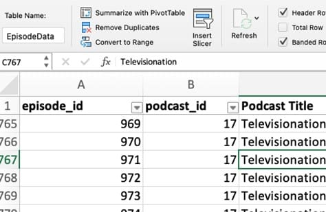
There are some differences in naming tables between Macintosh and Windows versions of Excel but, generally, you name the data table by clicking into any cell in the data, then selecting the “Format as Table” icon from the middle of the Home ribbon. Choose any design (this can be changed later) and select OK. The data will redraw, according to the design selected. It will also activate the Table ribbon.
To name the table, click into the Table ribbon, the first item of which is “Table Name”. You’ll see a default like “Table1”. Change this to something more descriptive. In this case, the table name will be “EpisodeData” (note that spaces are not allowed).
Step 3: Open the Pivot Table
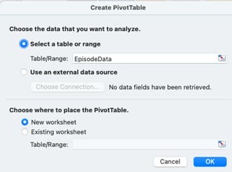
Note that next to the Table Name in the Table Ribbon is a button called “Summarize with PivotTable”. If this does not appear, click on a cell anywhere within the data table to activate it. When you click “Summarize with PivotTable,” a dialog box appears to select the data set and determine where to present the pivot table.
Notice in the screenshot below that the data set is preselected to be “EpisodeData” but that the pivot table can also be set up to access data from an external source. Choose whether the pivot table should appear on a new worksheet (default and recommended) or on the existing worksheet. Selecting “New Worksheet” will show the pivot table on a new worksheet — aka tab. Accept these parameters and click OK.
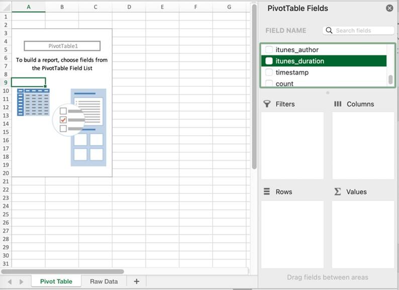
This will open a new worksheet with pivot table fields and functions on the right-hand side, as shown in the next screen capture. PivotTables are created by dragging a field from the Field Name list into one of the four boxes described in the Implementation section, above.
Step 4: Create Your First Pivot Table
Let’s discover the average length of a podcast episode. Scroll down the Field Name list to locate the “itunes_duration” field. This is the field that contains the duration of each episode in seconds. In a data set with a lot of fields, you can use the search function at the top of the field list to quickly find the field. Drag that field into the Value box. Immediately, the pivot table updates to show the data selected.
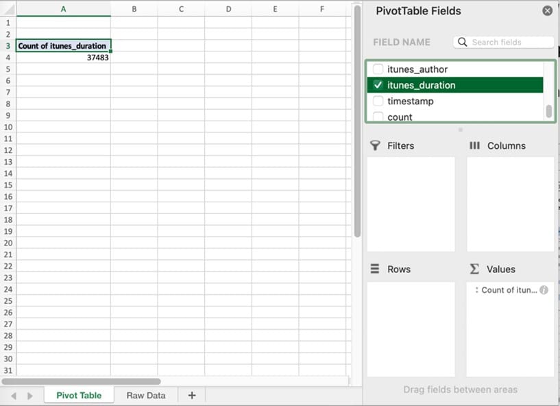
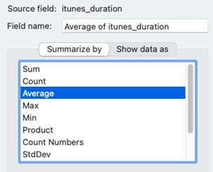
Note that the pivot table displays “Count of itunes_duration”. But we don’t want a count of the number of episodes; we’re looking for the average. To change this to an average, click the icon or drop-down arrow next to the field that was dragged into the Values box, or, on a Mac, click the stylized “i” icon next to its appearance in the Values box. A dialog box, such as that shown below, appears, showing the range of functions that can be used on that data. Select “Average” and press OK.
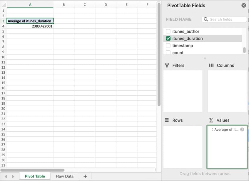
The pivot table display will immediately change, or pivot, to show the average length of an episode across all 37,483 episodes.
Step 5: Using a Pivot Table to Extract Patterns
So, we now know that the average podcast episode is 2,383 seconds, or 39.72 minutes. But what about seeing if things have changed over time? Have podcast episodes gotten longer or shorter? In the Field Name list, locate and select the field name Pubdate2 (the date that the episode was published), and drag it down into the “Rows” box. Immediately, the pivot table redraws to show the average per year for the 15 years of data available.
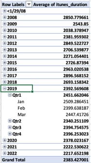
Note that, because Excel recognized this data as a fully qualified date, it automatically included quarterly and monthly summaries as well. These can be opened and closed via the +/- icon next to each level of data.
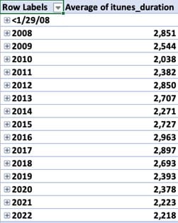
Let’s take a moment to reformat this data to eliminate the five digits to the right of the decimal point, which make the data harder to read. Right-click on any cell containing an episode average and select “Number Format…,” which will show you a standard dialog box for formatting, including the thousands separator and the number of decimal places. (It might seem logical to select “Format Cells…” but “Format Cells…” will only format the numbers in that single cell. “Number Format…” formats all the numbers in that column.)

The PivotTable now shows that, over the 15 years of data, the average podcast episode has gotten significantly shorter, from 48 minutes (2,851 seconds in 2008) to 37 minutes (2,218 seconds in 2022).
Step 6: Display the PivotTable in a Chart
Eyeball that list of annual averages and some variances can be seen. However, it might be easier to look at this data as a bar chart. To do this, click anywhere within the pivot table data and select “PivotChart” from the “PivotTable Analyze” ribbon. Instantly, a bar chart will display, showing the total annual averages of podcast episodes.
Remember how the Excel PivotTable recognized the date field and automatically set up quarters and months as well as years? Well, the bar chart is dynamic, too, and reflects what is displaying in the pivot table. Click on the plus sign next to one of the years. and that part of the bar chart expands to show quarterly data.

Step 7: Filtering Your Pivot Table
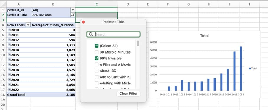
Remember filters? Here’s how they work. Drag any Field Name into the Filters box, and it will appear as a drop-down menu above the pivot table. You can choose to display the result from one or more individual podcast titles. The screen capture below shows the data filtered to display the duration of one podcast, which has gone against the trend by increasing episode duration significantly over the years.
Advantages and Drawbacks of Using Pivot Tables
There are numerous advantages to using pivot tables. They give you a quick way to run different views of a set of data to pull actionable reports without having to spec out and request reports. In fact, it doesn’t take much training for a person to create the view of the data they need in just a fraction of the time it would take to request a new cut of the data.
However, there is a cost. While pivot tables are easy to use and intuitive, mastering them does take some learning time. It may not serve your business needs to have front-line people building their own pivot tables. Another drawback is that it can be resource-intensive to run larger or more complex pivot tables — they are not likely to replace advanced reporting solutions. Finally, remember that the pivot table is not accessing the actual data but, rather, a special cache of the data that can best be thought of as a snapshot. If the underlying data changes, the pivot cache must be refreshed so that the new data is reflected in the pivot table.
What Are Pivot Tables Used For?
Pivot tables are useful whenever someone would like to do ad hoc analyses of data. In the example in this article, the analyst was able to quickly summarize the average length of a podcast episode across 15 years of data and could then look into trends for any of the variables in the data set, via the Filters function. The data was summarized by year, quarter and month, and a dynamic bar chart could be automatically generated to show trends.
Here are examples of pivot tables for different types of data:
-
Sales data:
A pivot table can be used to show each salesperson’s total sales trends throughout the year or beyond; or data can be shown per customer, so it’s easy to identify which customers are the biggest sources of revenue, or by region, to determine the areas where the most sales occur.
-
Marketing data:
Pivot tables can be used to perform ad hoc analyses of which advertisements or content assets are generating the most leads, or whether any marketing assets are converting better to sales.
-
Inventory data:
Assuming your inventory is tracked and data collected in a way that enables analysis, pivot tables can be used to investigate questions like the composition of inventory by product; inventory turns by product, warehouse or retail store; and many others.
It’s important to note that pivot tables both help you understand business performance, by answering specific questions like podcast length, as well as uncovering anomalous data points that surface along the way like outliers. The sense these examples are meant to convey is that ad hoc analysis using pivot tables is limited only by the data your organization has collected, its quality and your imagination.
Stop Creating Your Pivot Tables by Hand

Gain Business Insights With NetSuite SuiteAnalytics Pivot Tables
Excel data tables are only one data source for pivot tables. While this article describes how to use Excel PivotTables, NetSuite’s SuiteAnalytics module includes a Workbook Pivot Table capability that has all the same abilities as Excel and operates in much the same way. But because it operates on NetSuite data, it lets business decision-makers perform ad hoc analyses on all of their company’s integrated data. Rather than getting a static spreadsheet, as with Excel, NetSuite data is constantly updated in real-time so it’s always up to date. Plus, users can drill down from the workbook to view the underlying data.
Pivot tables are a powerful and fast way to turn data in a spreadsheet into insights that can drive a business. The friendly and easy-to-use pivot table interface enables all sorts of ad hoc data investigation by business decision-makers, even those with little previous data analysis experience. Once users get the hang of pivot tables, it will literally change the way they look at data.
Pivot Table FAQs
What is the difference between an Excel table and a pivot table?
An Excel table is a range of data that has been defined. For example, a portion of a spreadsheet can be selected and defined as “Sales Data”. Excel tables can be sorted and filtered but doing so changes the data structure. Pivot tables, on the other hand, allow data to be sorted and filtered without changing the original data. Pivot tables also allow a user to see the underlying data from different dimensions.
What are the advantages of pivot tables?
One of the main advantages of pivot tables is that their simple, user-friendly features help even beginner users glean insights from the data. Second, the underlying data can be manipulated without being changed. It’s a valuable tool for users of all levels — analyst and decision-maker — to understand and monitor business performance, in real-time. Finally, pivot tables are fast.
Why is it called a pivot table?
Pivot tables are so-called because they “pivot” the data from a spreadsheet around specific parameters to enable views of the data from different perspectives — but without actually changing the data’s structure.
How many types of pivot tables are there?
There are a couple of ways to answer this. First, many software programs that store and/or analyze data offer pivot table functions, so there may be as many different types of pivot tables as there are data and analytics software providers. Second, in the context of Microsoft Excel, there are three different kinds of pivot table layouts from which to choose. These are Compact (different rows collapse into one), Tabular (one column per field) and Outline (similar to Tabular but able to display subtotals at the top).


