“The only worse design than a pie chart is several of them,” says Edward Tufte, noted statistician and professor emeritus of political science, statistics and computer science at Yale University. His 1983 book, “The Visual Display of Quantitative Information,” has long been held as a gold-standard reference for excellent communication. But is Professor Tufte right? Can the ubiquitous pie chart really be that bad? And is there anything a pie chart can do that a bar chart or line chart can’t do better?
The answer, of course, is that pie charts can, and do, play an important role in effective communication — in fact, one early use of pie charts helped expand human life expectancy by 50%. It’s just that they have their limits. Knowing those limits will help you become a better communicator and presenter.
What Is a Pie Chart?
A pie chart is a circular, graphical representation of data. It’s an attempt to convert a table of data into a memorable idea by using a circle — the “pie” — divided into sections, or slices. It’s ideal for communicating the composition of data. How are employees distributed among a company’s departments? How many employees work remotely vs on-site? When our business loses sales, how are the “wins” distributed among our top five competitors? What percentage of all votes were cast for each candidate in an election?
A pie chart’s greatest strength is how compactly and simply it can convey its idea. And therein lies the pie chart’s biggest limit: It must be at-a-glance simple. Can an underinformed person look at the pie chart and gain valuable information — or even insight?
Pie Chart vs Bar Chart:
Whether to use a pie chart or a bar chart depends largely on what question the chart is attempting to answer and how much information needs to be communicated. Pie charts are more effective at communicating the differences between numbers, so it’s important that the relative size of the pie slices be distinguishable at a glance. Pie charts are best used to represent a simple, single layer of information where the differences between the numbers are the entire story. Pie charts are not effective at surfacing trends.
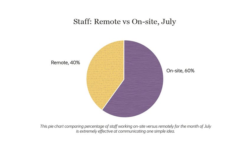
Look at the pie chart immediately below, which breaks down the staff of a company by whether they are on-site or remote. It clearly shows that more employees are working on-site. What it doesn’t say could fill an HR manual. What was the breakdown a year or a month before? How does this fit in with the human resources (HR) department’s goals? But it is extraordinarily effective at answering the one question: What was the remote/on-site staff breakdown in July?
Unlike pie charts, bar charts can display multiple dimensions that communicate a larger story. A bar chart can take the same data displayed in the pie chart and expand it to monthly over the course of a year — allowing a much more nuanced picture to emerge.
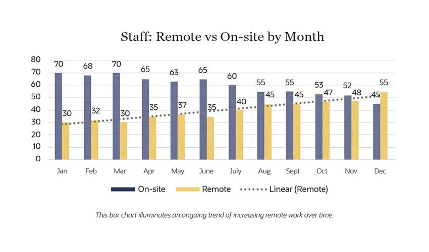
If this company’s HR department has an initiative to get more staff working remotely, this chart shows great success. It’s easy to visualize that the trend is moving in the right direction. The dotted trendline simplifies communications even further. It would not be possible to display this much information in a pie chart.
So, while it’s clear the pie chart more effectively illustrates the breakdown for one specific month, the bar chart makes it much easier to see trends. For any given set of data, if the goal is for viewers to understand the information at a glance, it’s usually easy to decide whether a bar chart or pie chart is best for the job.
Key Takeaways
- Pie charts are most effective at displaying a simple idea, usually with no more than five data points.
- Because they can convey their ideas with powerful impact, pie charts can be very influential.
- Intuitively, pie charts represent a whole, or 100%, so it’s important the slices add up to 100%.
- Many best practices contribute to the at-a-glance impact of a pie chart, but the most important is to keep it simple.
Pie Charts Explained
There is a variety of pie chart formats, but they all share these characteristics in common: They use a circle to represent the full, 100% set of data, which is then broken up into slices of different sizes, each of which represents a portion of the whole. Pie charts excel at helping to communicate differences in limited data sets. If the data shows a simple comparison among up to five items, a pie chart is a good, intuitive way for an audience to receive data. When data contains more than five portions, the differences between slices can be harder to discern, diminishing the visual impact of the chart’s main idea. In such cases, it’s often best to combine multiple data points into a single “Other” slice.
When telling a more complex story with data, an appropriate piece of that data could be turned into a pie chart as a tool to compel a reader to dig deeper into the data.
History of Pie Charts
The history of pie charts is more fascinating than many realize. A secret agent who plotted the collapse of the French economy with counterfeit money and the founder of modern nursing are but two of the intriguing historical characters who used pie charts to explain and advocate.
The first known pie chart was published in 1801 by Scottish engineer, political economist and secret agent William Playfair. It showed proportions of the Turkish Empire located in Asia, Europe and Africa prior to 1789. Playfair was no stranger to using graphics to interpret data and is credited with inventing the bar chart, area chart and line graph years before.
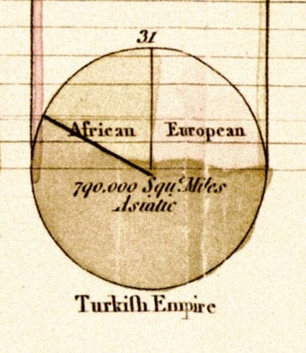
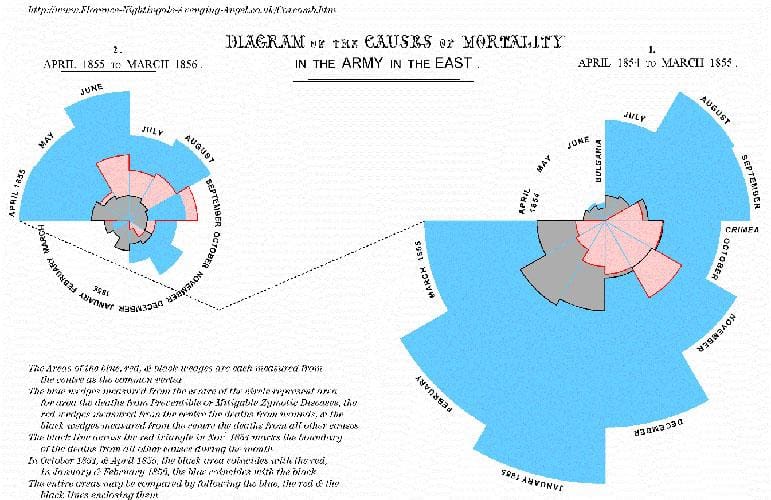
Playfair’s pie chart merely communicated data. It was not until half a century later that famed social reformer, statistician and founder of modern nursing Florence Nightingale used the pie chart to advocate change.
Her “Diagram of the Causes of Mortality in the Army in the East” wove many layers of data into a complex pair of pie charts — really what, today, we would call polar area diagrams — to show that improvements in sanitation in camps and hospitals during the Crimean War dramatically reduced the in-hospital death rate from disease. She used this diagram for the most modern of reasons: to argue before members of Parliament, who she knew would not read the data.
The consequences of her chart and efforts over the next 10 years led to sewage systems being installed in all English homes. This reduced the death rate so much that life expectancy in England climbed from 40 to 60 years old.
Since then, dozens of pie chart variations have been developed in attempts to tell bigger stories. Donut charts provide space in the center for additional information, exploding charts break single slices into more slices and spie charts superimpose one pie chart on another.
Today, a crisis of sorts of pie chart overuse has resulted from spreadsheets’ ability to let people point and click to render charts. By comparison, early pie charts were the result of years of study.
When to Use a Pie Chart
Pie charts are best used to display a simple set of information where there are not many points of data. They excel at a comparison of two to five elements. They are particularly useful for visualizing the difference between data points, whether that difference is extreme (respondents split 70/30) or narrow (respondents split 50/50).
Probably the first thing to ask when thinking of using a pie chart is whether another type of graphic might be better suited. Is there trending information in the data? Pie charts are not able to display trending information so consider a line or bar chart instead. Is it a comparison of data elements from one line in a spreadsheet? In this case, a pie chart may work as long as there are not too many elements being compared.
Benefits and Drawbacks of Pie Charts
It’s important to remember that pie charts can tell only a fraction of a whole story, which may sound like a drawback but can become a benefit when this limitation is used to advantage. A well-executed pie chart integrated into an effective story can intrigue the viewer into wanting to learn more. Here’s a look at other pie chart benefits and drawbacks.
Benefits:
The main benefit of pie charts is that they can be intuitively understood. An underinformed audience can look at a well-designed pie chart and gain instant knowledge. Pie charts make it very simple for someone to compare data at a glance and see the composition of the data set. Pie charts can provide actionable information, as long as it can be distilled into simple, comparable points. Another benefit of pie charts is that they can distill data into a compact and convenient diagram that can be used as an element in telling a larger story.
Drawbacks:
The biggest drawback to pie charts is that they can effectively display only a very limited number of data points. They cannot display complex or extended sets of data because small percentages are difficult to discern. If the data being represented cannot be accurately displayed using just a few points, pie charts can mislead a viewer to inaccurate conclusions. A byproduct of a pie chart with too many points of data is that viewers start to focus more on trying to distinguish a small sliver of a slice than on understanding the meaning of the data itself.
Parts of a Pie Chart
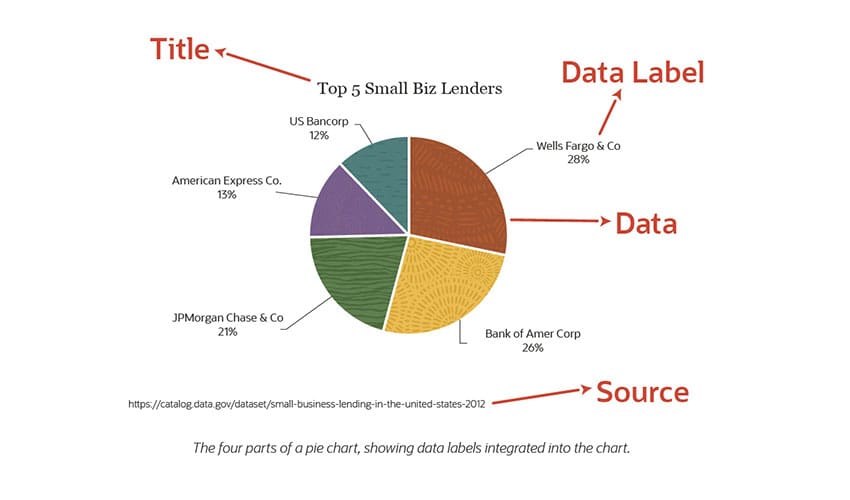
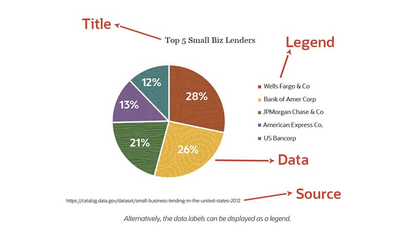
Several components must surround the main data “pie” for a pie chart to communicate its information and main takeaway, if any. These components typically include:
-
Title:
Usually displayed across the top of a pie chart is the title, used to describe what the data represents. The title should be short and punchy and note any limitations to the data. “Staff: Remote vs On-site, July” is a good title because it describes everything about the data being illustrated, including that the data set is limited to one month. Some consider titles optional, but it is a good idea to take advantage of them to help people quickly understand what they are looking at or to drive home the chart’s main takeaway.
-
Legend:
Pie charts sometimes benefit from a separate listing of what each slice represents. Such a legend can appear across the bottom or be stacked either to the left or right of the pie. The legend acts as a table of contents, enabling viewers to read through a list of everything that is included in the pie chart. Each legend item includes the color used for that element in the chart to help a user visually move from the legend to the data. Often, pie charts will omit the legend in favor of labeling the actual slices. A legend is also an easy way for a pie chart maker to see whether the pie chart has too many data points.
-
Source:
When applicable, it is important to provide attribution for the source of the data. This is often placed underneath the chart or at the end of a caption. The benefit of including source attribution is twofold: Giving credit to the data source is an academic (and sometimes legal) requirement and — more important — source attribution lends credibility to the pie chart.
-
Data:
No data, no pie chart — data is the heart of the chart. Remember, pie chart data should be simple and easy to interpret. Each point of data should be displayed as a slice of the pie, with each slice presented in a different color.
-
Data labels:
The slices of a pie chart often include a label specifying what percentage of the data set each slice represents. Depending on the purpose of the pie chart, this may or may not be a required element. It’s important to remember that the pie represents a “whole,” or 100%, so the labeled data needs to add up to 100%. If it does not add up to 100%, it may confuse viewers. The data label can also include the name of the slice. This is useful because it provides all of the information in one line, reducing the need for a viewer to constantly scan between the pie and its legend.
Types of Data or Statistics to Highlight With a Pie Chart
Given pie charts’ limitations, there is only a narrow definition of the types of data that they can display best. Generally, the data must represent different parts that compose some whole thing, such as all the sales of individual products that go into the total revenue of an ecommerce web site. The chart can then illuminate each product’s, or each product category’s, contribution to total sales.
Important characteristics of the type of data best suited to pie charts include:
-
Categorical: The data must have distinct categories that are related to each other. Five categories is a good limit for maximum visual impact; going beyond 10 might render the chart confusing.
-
One set of data: A pie chart cannot show multiple data sets.
-
No negative values: If there are negative values, a pie chart will not work.
-
Avoid zero-values: While they will display on a pie chart, a zero renders no slice, so it makes the chart confusing.
6 Pie Chart Best Practices
These 10 best practices for pie charts all contribute to one goal: Keep it simple. They include suggestions for ways to keep it simple, as well as tempting visual tricks to avoid because they usually end up getting in the way between viewers and their clear interpretation of the information.
-
Limit slices: Try to include no more than five slices. More than five makes the pie chart harder to read and may muddy the message.
-
Use different size slices: Pie charts are good at displaying the differences among slices, so they perform best when the data points are dissimilar.
-
Sum to 100%: Visually, the pie represents a whole. If your displayed data adds up to more or less than 100%, the credibility of the pie chart will be questioned.
-
Use percentages: Because pie charts always display parts of a whole, data labels showing absolute numbers cause confusion. Use percentages in data labels.
-
Use “Other” slice: If there are more than five data points, consider grouping the smallest data points into an “Other” slice to maintain visual impact. But avoid a dominant “Other” slice, which reduces credibility, by going a bit beyond five slices to reduce the size of the “Other” slice.
-
Avoid multiple pies: Expressing comparisons via pie charts is usually confusing. If data comparison is needed, bar charts are much more effective.
How to Make a Pie Chart
Nowadays, most pie charts spring from spreadsheet programs such as Microsoft Excel. Good enterprise resource planning (ERP) systems and simpler accounting software programs can also produce pie charts for reports and dashboards, and function similarly. Here’s how to make a pie chart in Excel, explained in 10 discrete steps:
-
Open the spreadsheet containing the data for the pie chart. For this example, we used archival data from the US Small Business Administration (SBA) that looks at small business lending from 94 lending institutions in 2012, which was the last year for which the SBA released this information in CSV file format. Since then, it’s only available in PDF format. To follow along, download the CSV at https://catalog.data.gov/dataset/small-business-lending-in-the-united-states-2012.
-
Consider what data to convey in the pie chart. Our analysis identified two potential fields that would provide interesting data: total amount lent and total number of loans. Let’s display a pie chart showing the total number of small business loans by lending institution.
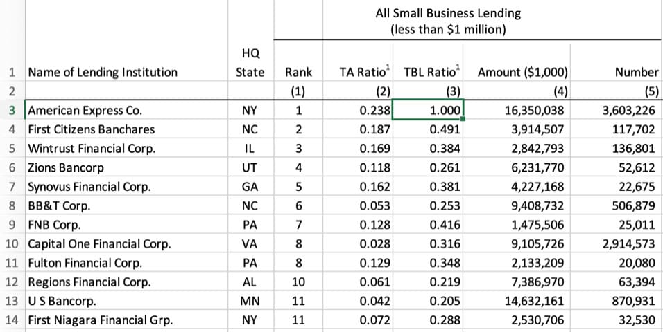
This spreadsheet data shows small business lending by US banks in 2012. -
Since creating a pie chart in Excel requires labels and data to be in adjacent columns, copy the number-of-loans column and insert it next to the column with the name of the lending institutions.
-
Sort the table by the new numbers column, in descending order. Be sure to select the entire data set to maintain data integrity. What results is a list of lenders that have lent to small businesses in descending order of the total number of loans.
-
Select the names and associated amounts of the top five lenders. Note that lenders with no data will appear first so make sure to disregard them.
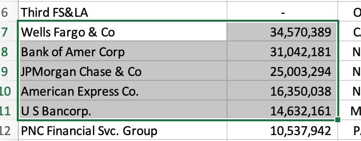
The top five lending institutions, sorted by the number of loans made. -
Go to Excel’s Insert ribbon and click the pie chart icon; the image below will appear. Select the first pie chart.
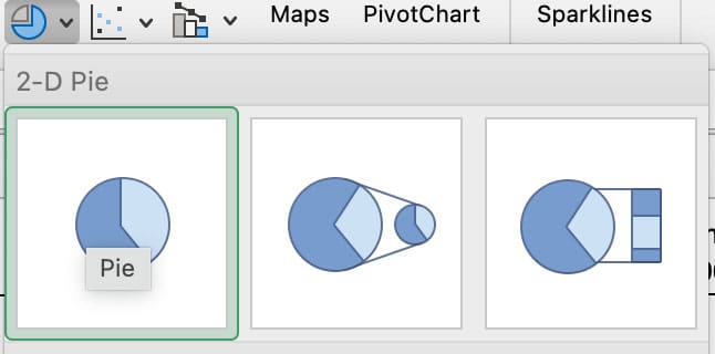
Microsoft Excel’s utility for creating a pie chart out of selected data. -
Presently, the pie chart shown here will appear in the center of the screen.
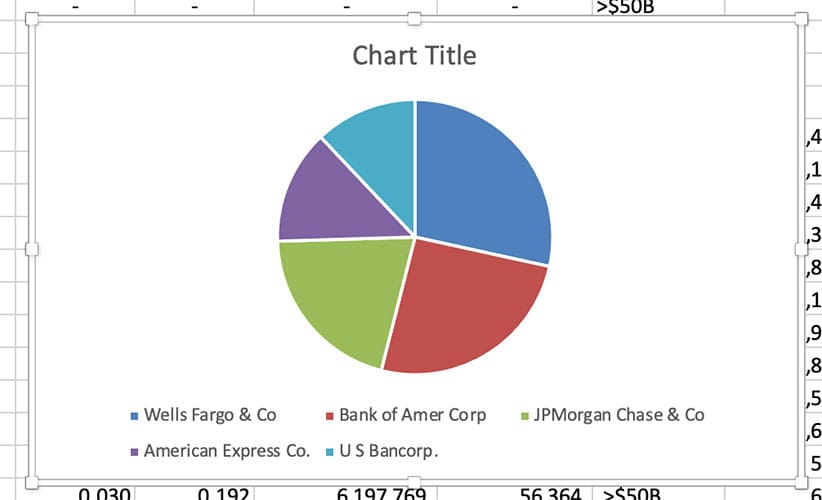
The default pie chart generated by Microsoft Excel. -
Highlight the chart title and enter in a title describing the chart. For example, “Top 5 Small Biz Lenders.”
-
To add labels, click on the chart itself and then right-click. The data labels will appear containing the amount from each column. We want the percentages, not the values, to show up, so right-click on the pie chart again and select “Format Data Labels.” Deselect “Values” and select “Percentages.” If these labels need to also contain the name of the slice, also click on “Category Name.”
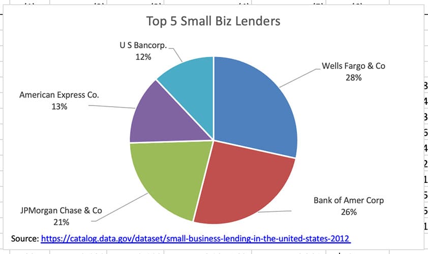
The final pie chart comparing the top five small business lenders. -
Now the chart can be resized by grabbing one of the corners and dragging. It can also be copied-and-pasted into another program.
That final pie chart compares only the top five lending institutions — not the entire data set.
Pie Chart Examples
In addition to the pie charts already exemplified throughout this article, there is a wide variety of approaches graphic designers have created to give their charts visual pop or as an attempt to convey more information than basic pie charts can support. Here are four examples.
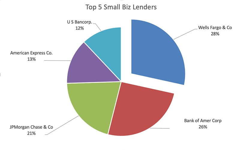
The Exploding Pie Chart:
This version of the common pie chart is used mainly for emphasis of a particular slice. It’s meant to call special attention. The creator of the chart below would use it to speak specifically about Wells Fargo & Co.
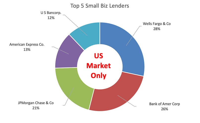
The Donut Chart:
A donut pie chart is exactly the same as a regular pie chart except it has a hollow center, providing a way to highlight specific additional information.
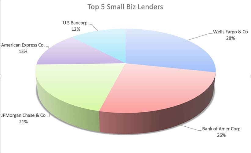
The 3D Pie Chart:
This graphical gimmick is useful for adding visual dimension to a report. But take care — it distorts the view of the chart so that some of the slices may appear larger than they really are. Note how the Bank of America slice looks larger than the Wells Fargo slice but, as the data shows, it is smaller.
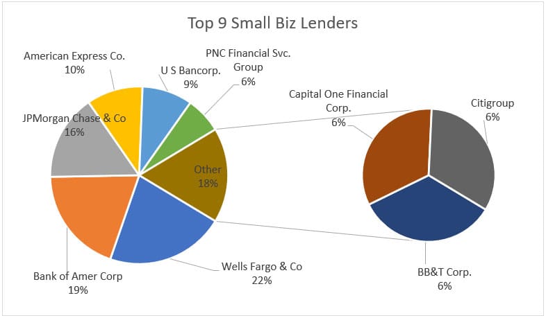
The Sub-pie Pie Chart:
This chart enables presentation of more slices but results in a less readable graphic, due to added complexity. The example shows the top nine US small business lenders, three of which have been combined into an “Other” category in the larger chart. A secondary chart shows the breakdown of the “Other” category. More information is conveyed but at the cost of the pie chart’s main benefit: simplicity.
4 Tips for Creating Pie Charts
The key to effective pie charts is to keep them simple. Avoid trying to communicate anything beyond a label and its associated percent. People intuitively look at the whole pie as representing 100% and the slices as a percentage of the whole.
-
Avoid 3D: A 3D pie chart is harder to read because the added perspective distorts the sizes of the slices.
-
Group by size: Pie charts are most readable when slices are grouped by size. It’s best with the largest two slices abutting.
-
Use distinct colors: Different colors for each slice better distinguishes the differences between them. Use a comfortable color palate — you want the differences distinguished, not garish.
-
Don’t rotate text: Keep labels horizontal; angled text is difficult to read.
Free Pie Chart Template
Click the link button below to download an annotated Excel spreadsheet containing a template for creating classic, simple pie charts. The template uses best practices to generate a modifiable sample pie chart. Add and change categories, update the numbers, and the results display instantly on the sample chart.
Conclusion
Pie charts can be extraordinarily useful at showing very specific data, usually with a maximum of five data points. Pie charts are not meant to be the definitive representation of data but to contain enough information, as Florence Nightingale experienced, to get people who will never read the data to gain actionable understanding.
Pie Chart FAQs
What are the alternatives to pie charts?
Line charts and bar charts are the most common alternatives to pie charts. They display more depth of information because they’re good at illustrating trending and timeline data, whereas pie charts are not.
What is a pie chart used for?
Pie charts are best at conveying a small data set that makes up a “whole” something — i.e., 100% of it. For example, the votes received by each candidate in an election, which add up to all the votes cast for that election. A pie chart is best used for simple, two-dimensional information with up to approximately five data points. They excel at portraying a specific point in time.
How do you calculate pie charts?
A pie chart is best calculated by representing absolute numbers as percentages. Unlike other chart types, pie charts intuitively represent a whole, or 100%, so having the categories shown in percentages helps make a pie chart more understandable at a glance.
Why are pie charts bad?
Pie charts are not effective for showing trending information. They are best used for simple comparisons between up to five data points. If more than five data points are used, a pie chart becomes clumsy and confusing.
How do you explain a pie chart with example?
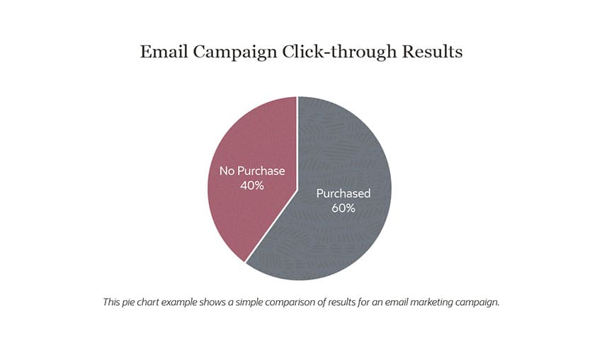
When explaining a pie chart, it’s best to focus on the size of the individual slices. Whether the chart shows an even split between two categories or a wide difference between more categories, the best explanation focuses on the relative sizes of the slices. For example, a pie chart displaying the results of an email campaign might show that the entire pie is all recipients who clicked on the email, and the two slices show how many purchased vs how many did not.
What is a simple pie chart?
The simplest pie chart is one that gives a viewer an at-a-glance understanding of the data. Whether the pie chart contains two categories or five, a simple pie chart is easy to understand.


